UEsearch
website / 2026
UEsearch was designed to transform static academic and creative documentation into a fluid, connected ecosystem. By developing a living repository that dynamically maps and cross-references projects, exhibitions, and publications, the platform links physical artwork with the online world. It turns traditional archiving into an interactive, open-access experience, making the intersection of design, technology, and academia accessible to the audience.
Visit the website here.
beats of changes
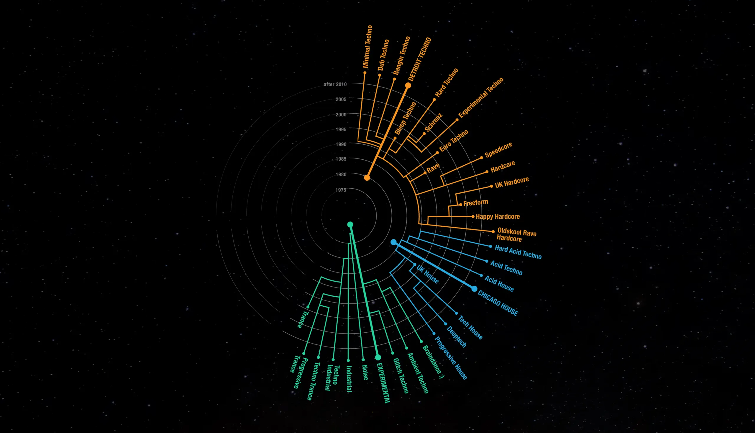
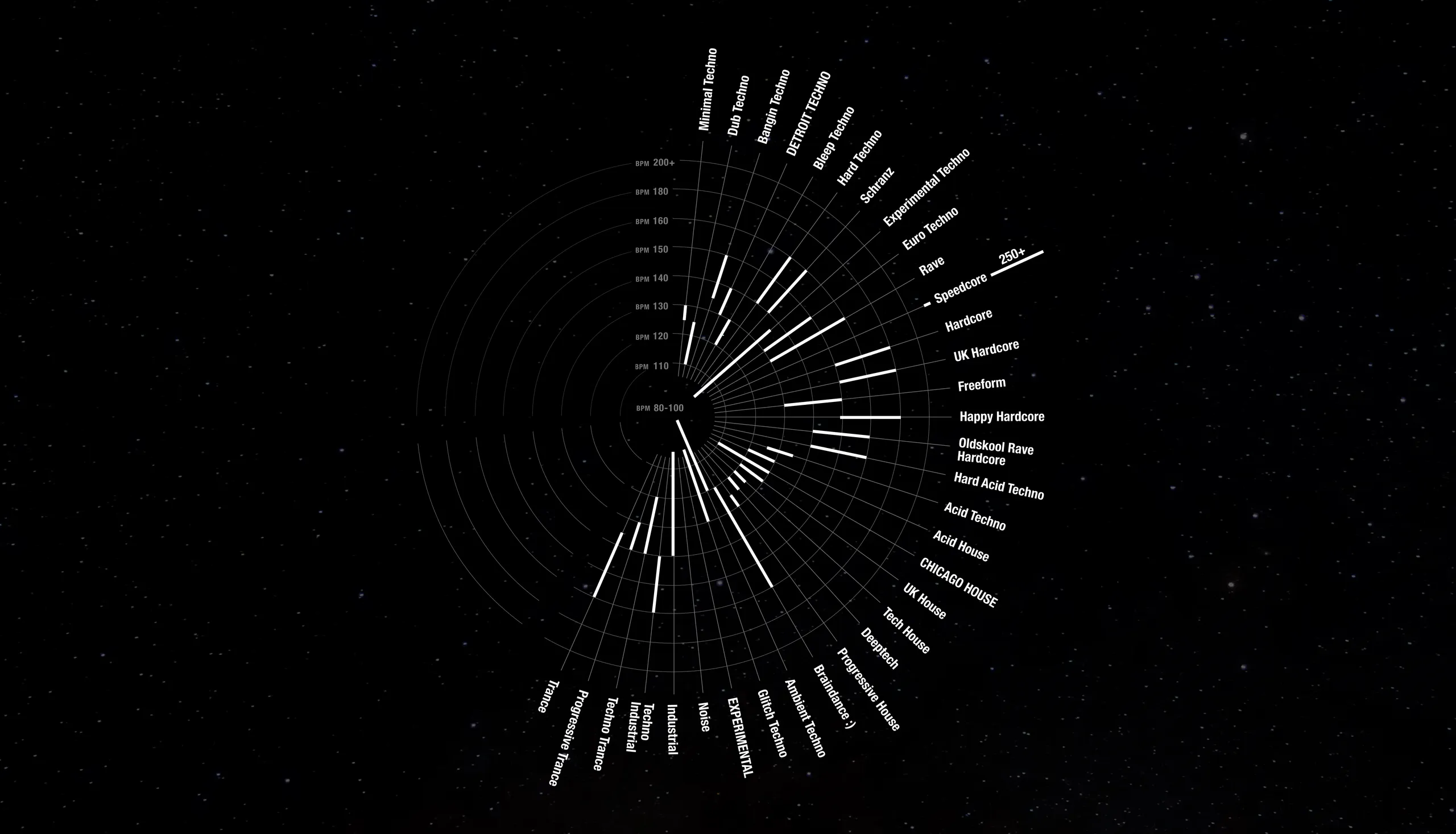
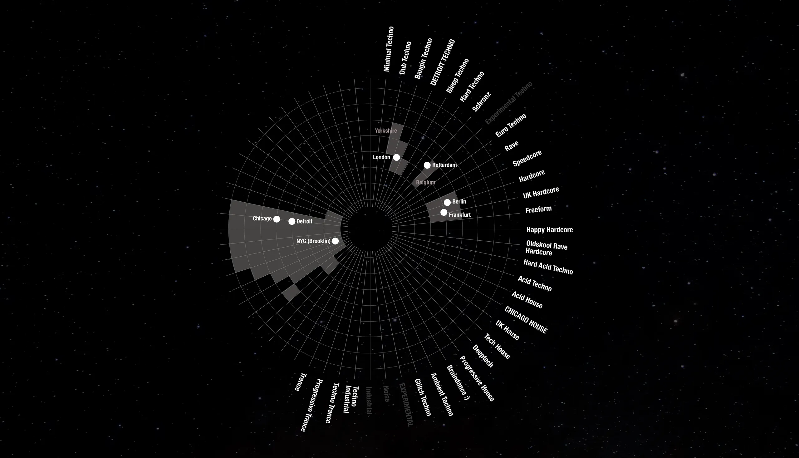
infographic / 2025
This infographic is by no means an exact history of the evolution of techno music. Not even of all of it. It is rather an attempt to start a project that brings together my curiosity about techno music (once I moved to Berlin) and my passion for data visualisation — and that remains as open and actual as the music it celebrates.
Full experience here.
copy
identity / 2023
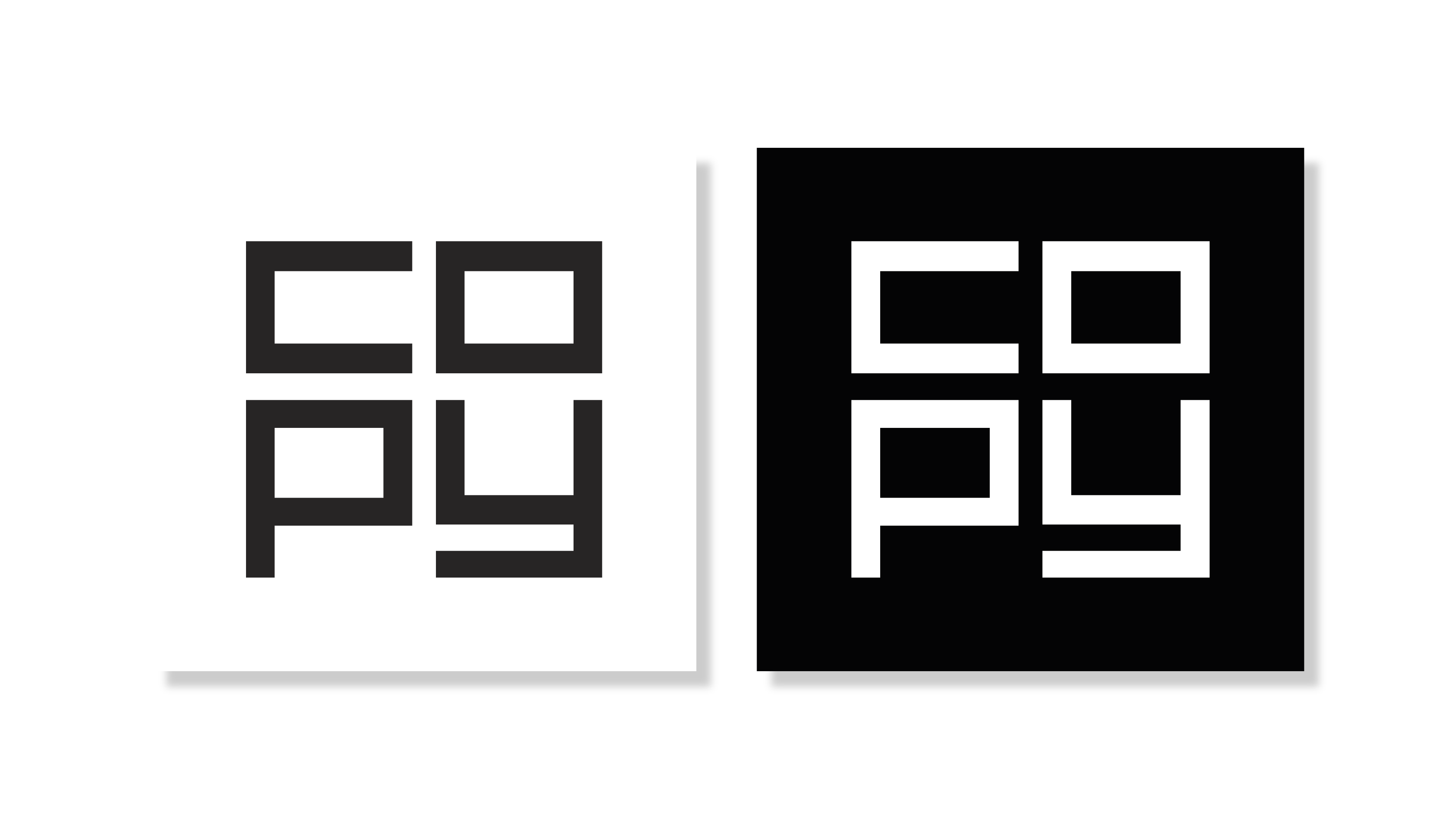
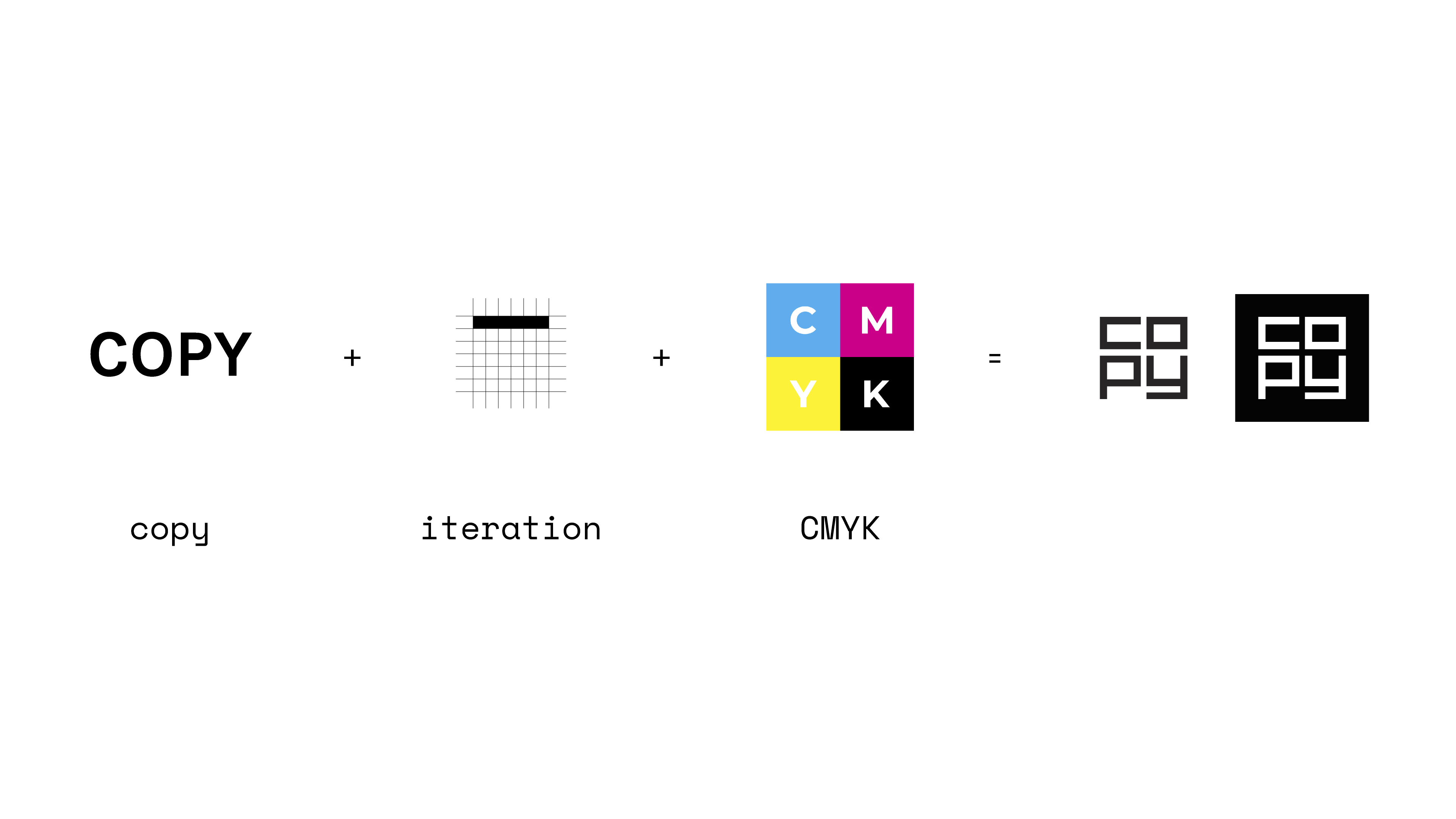
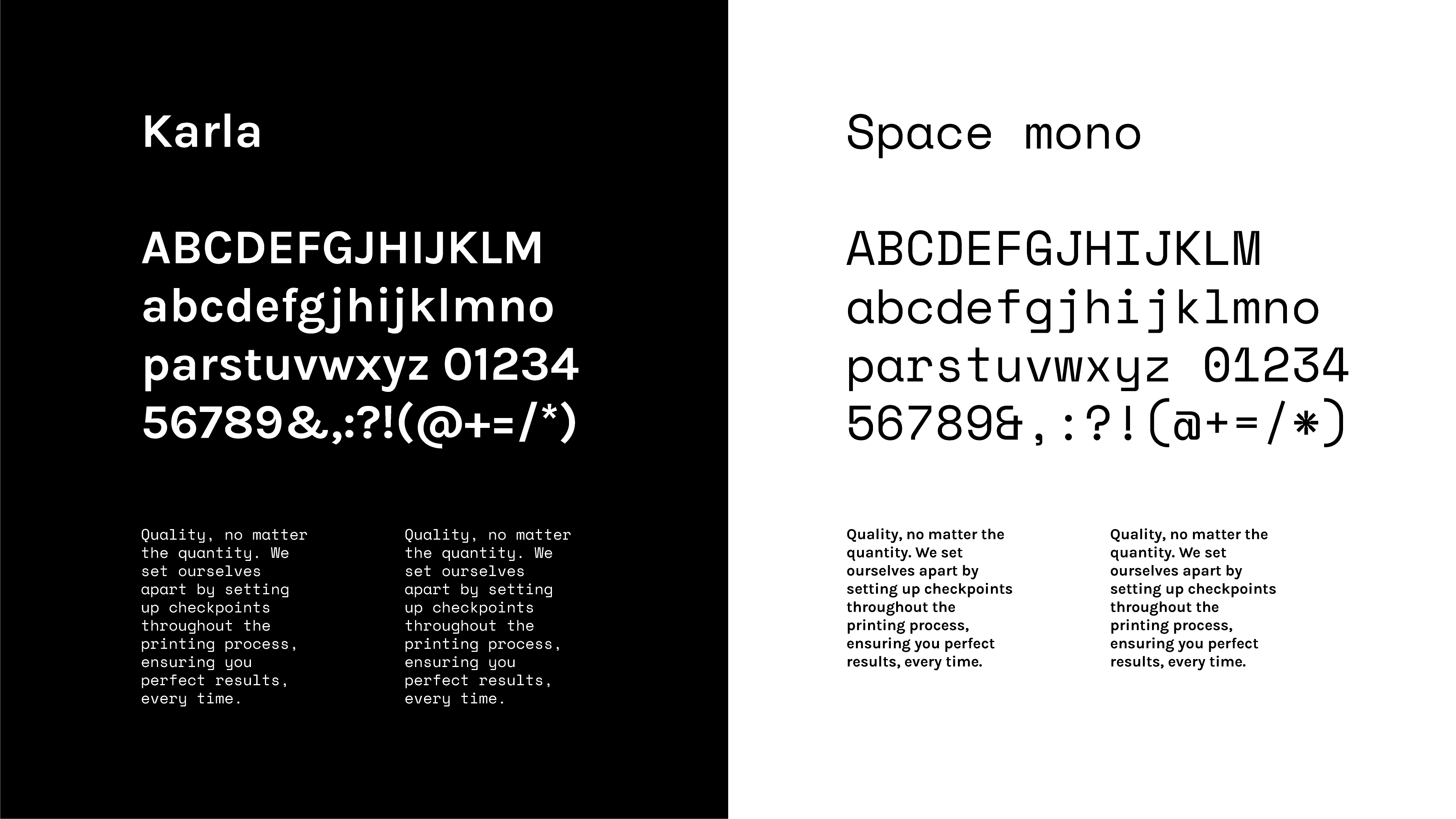
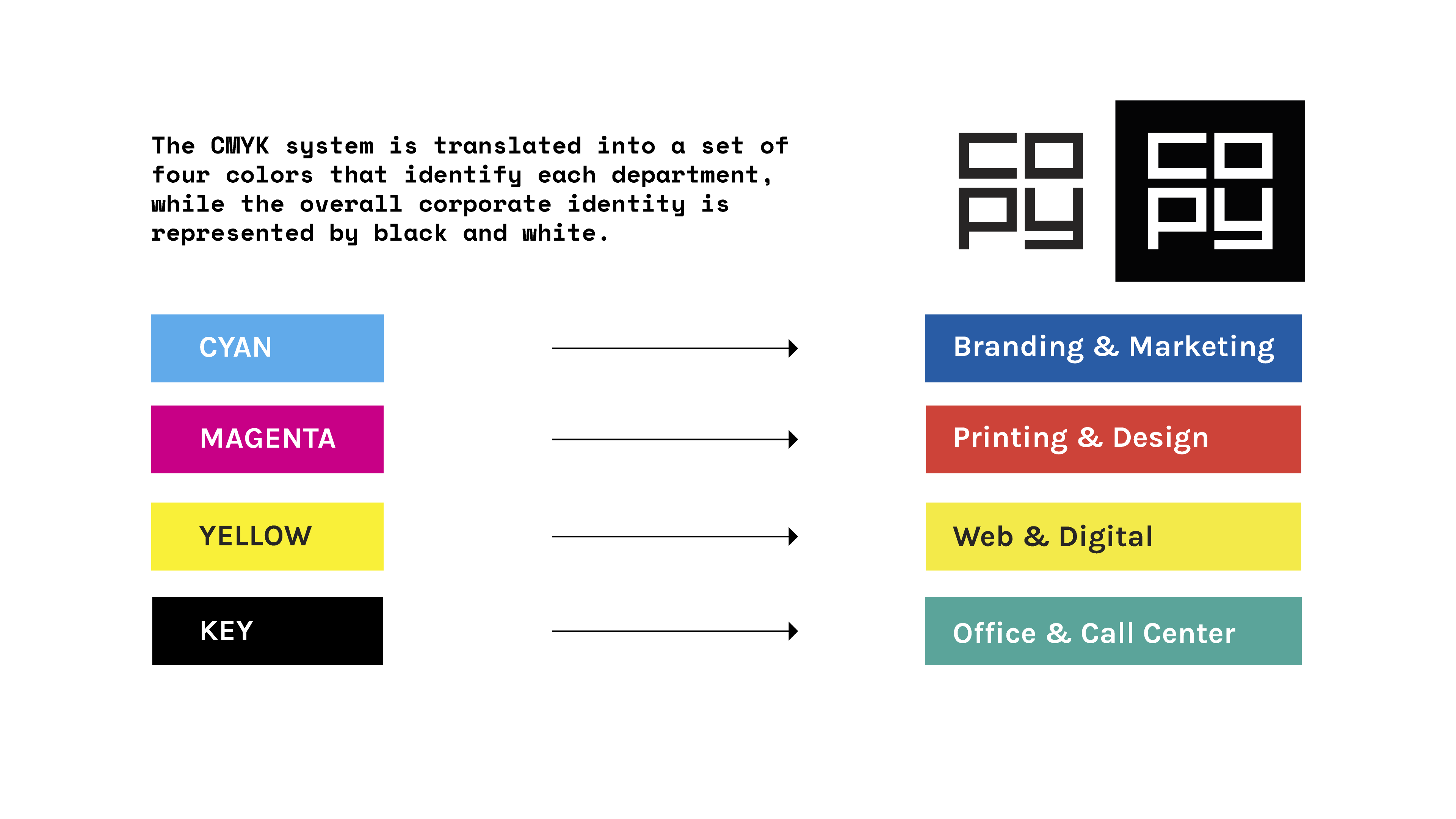
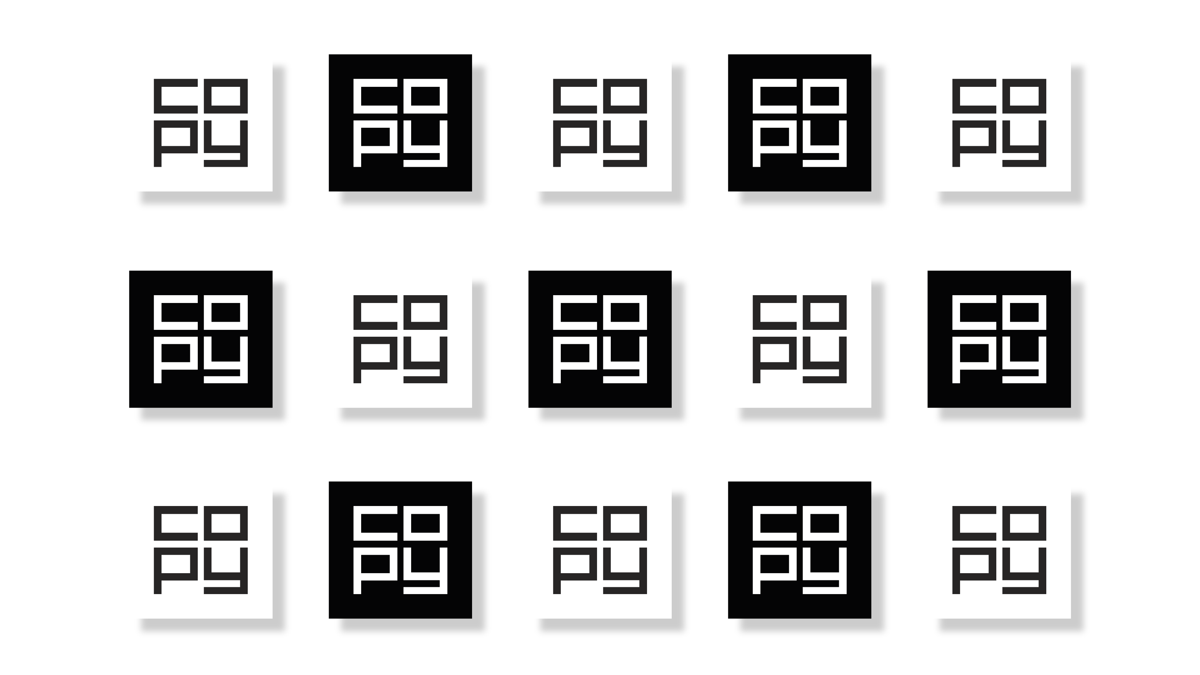
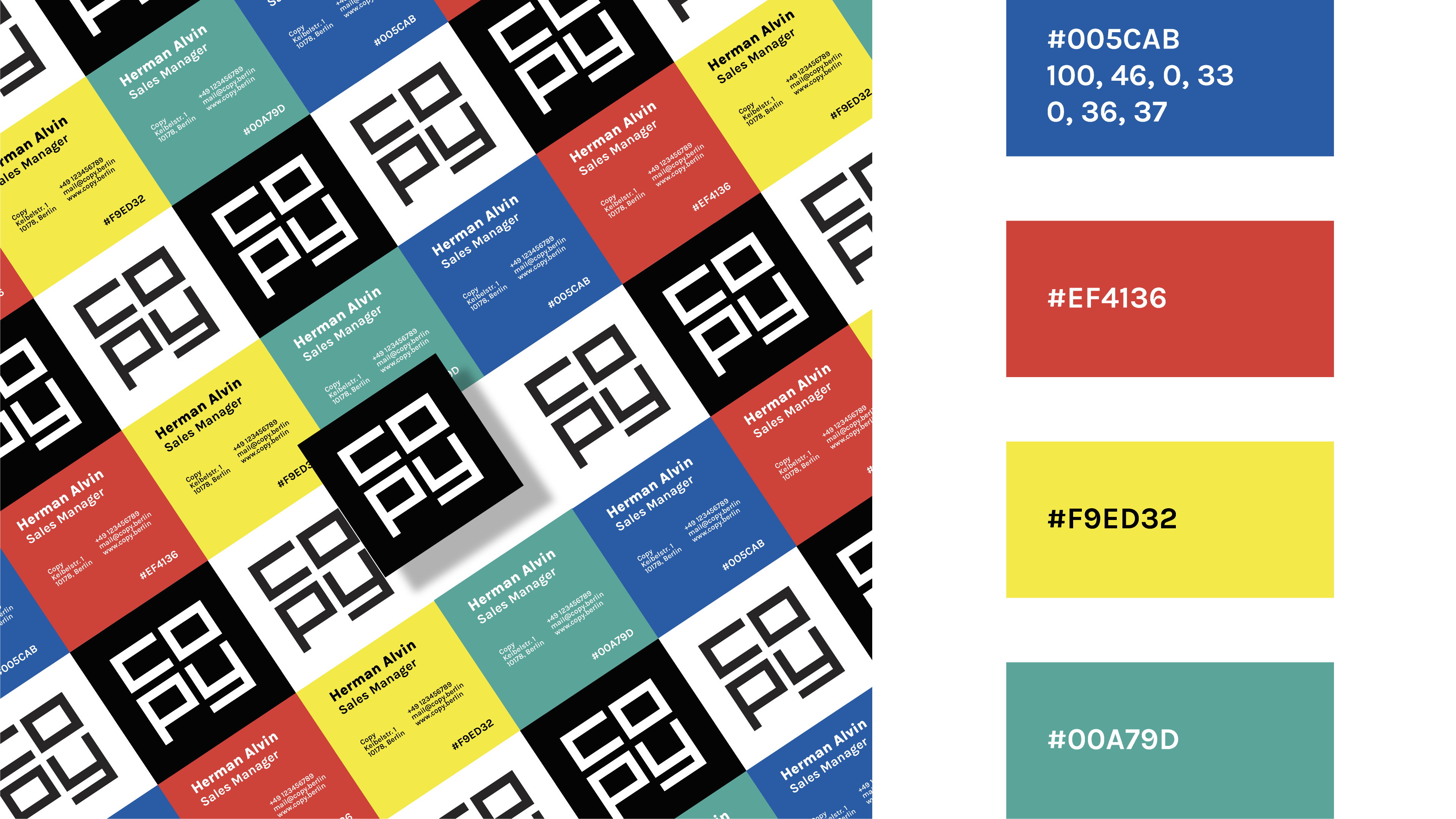
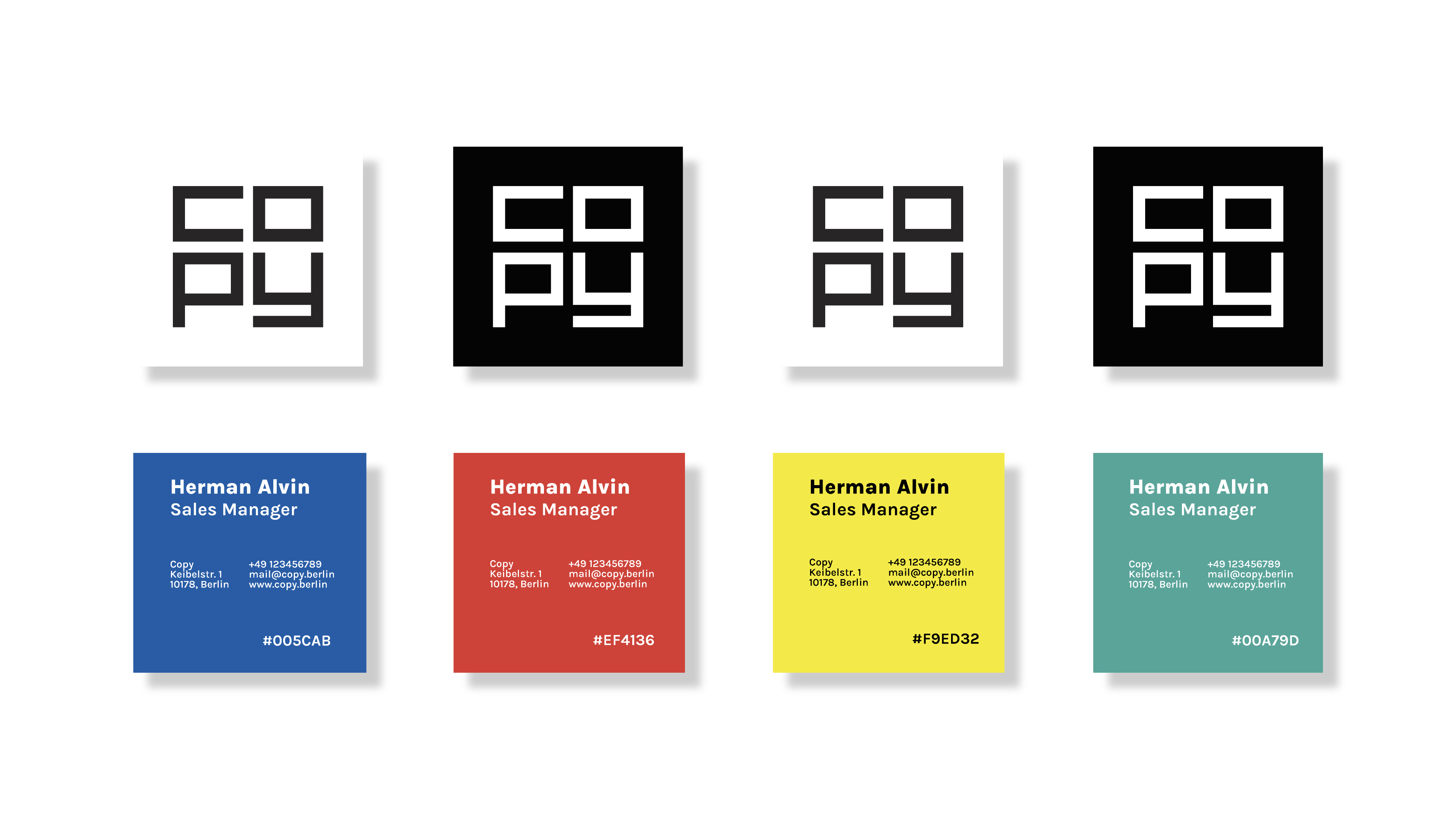
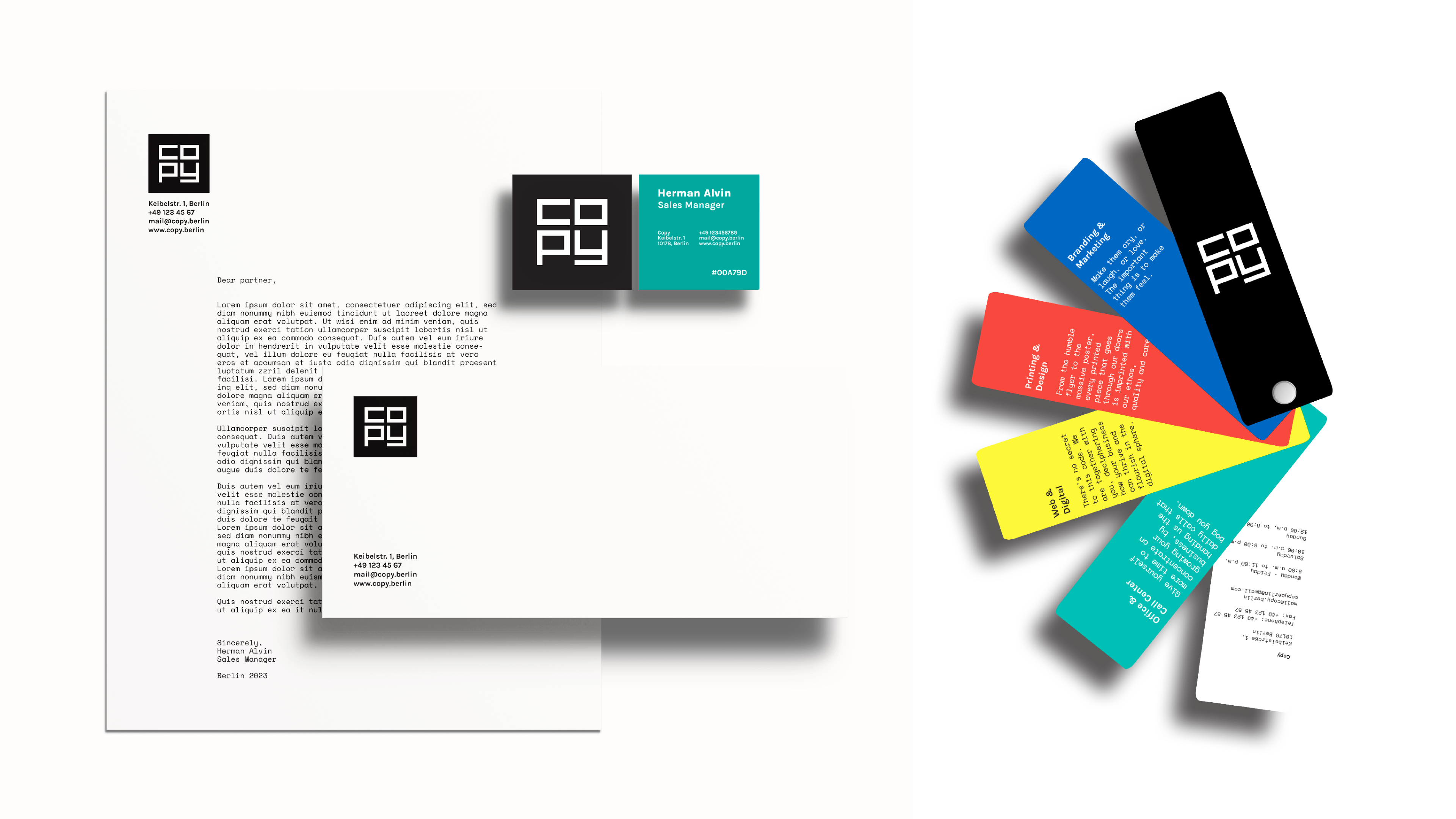
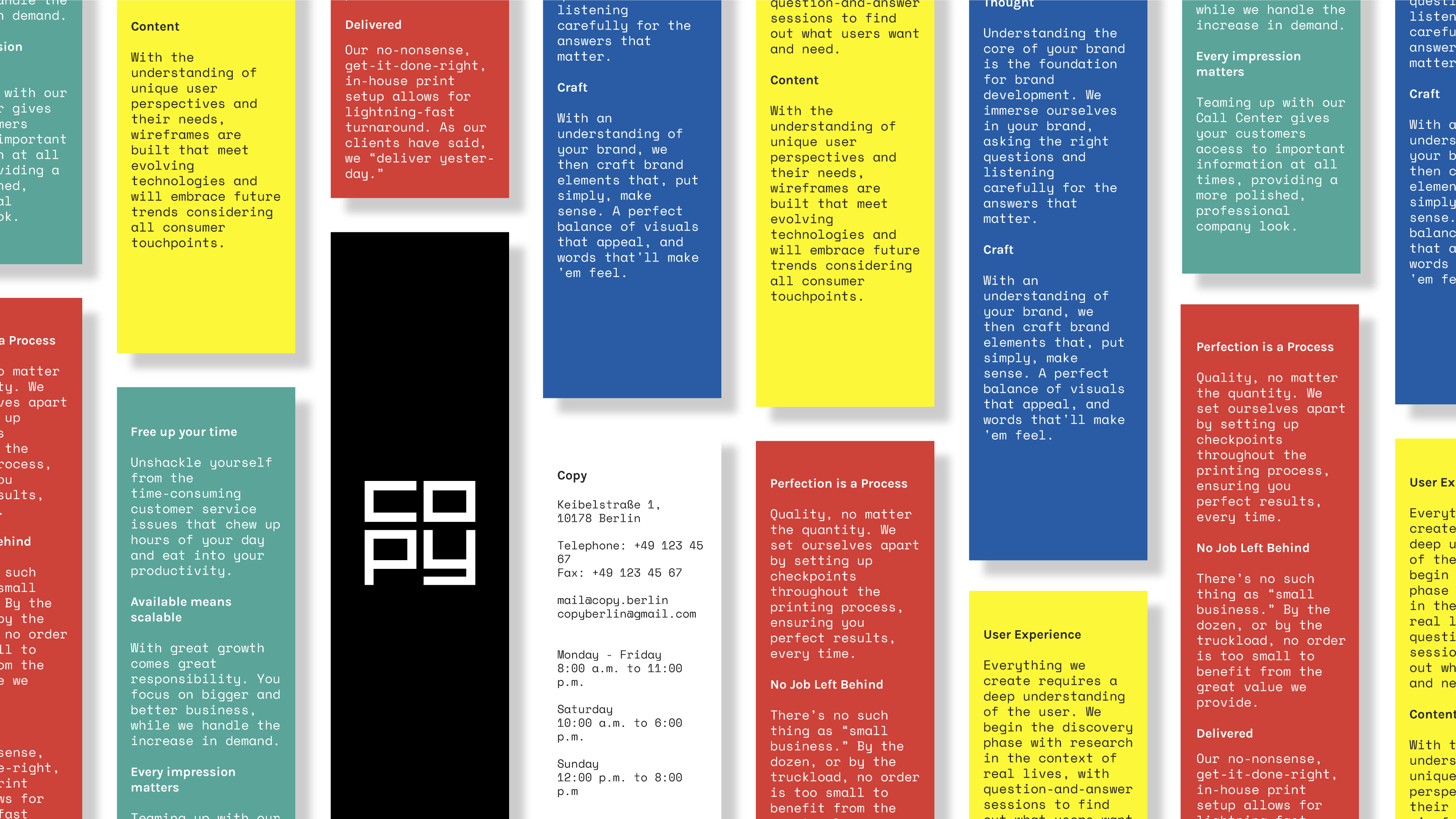
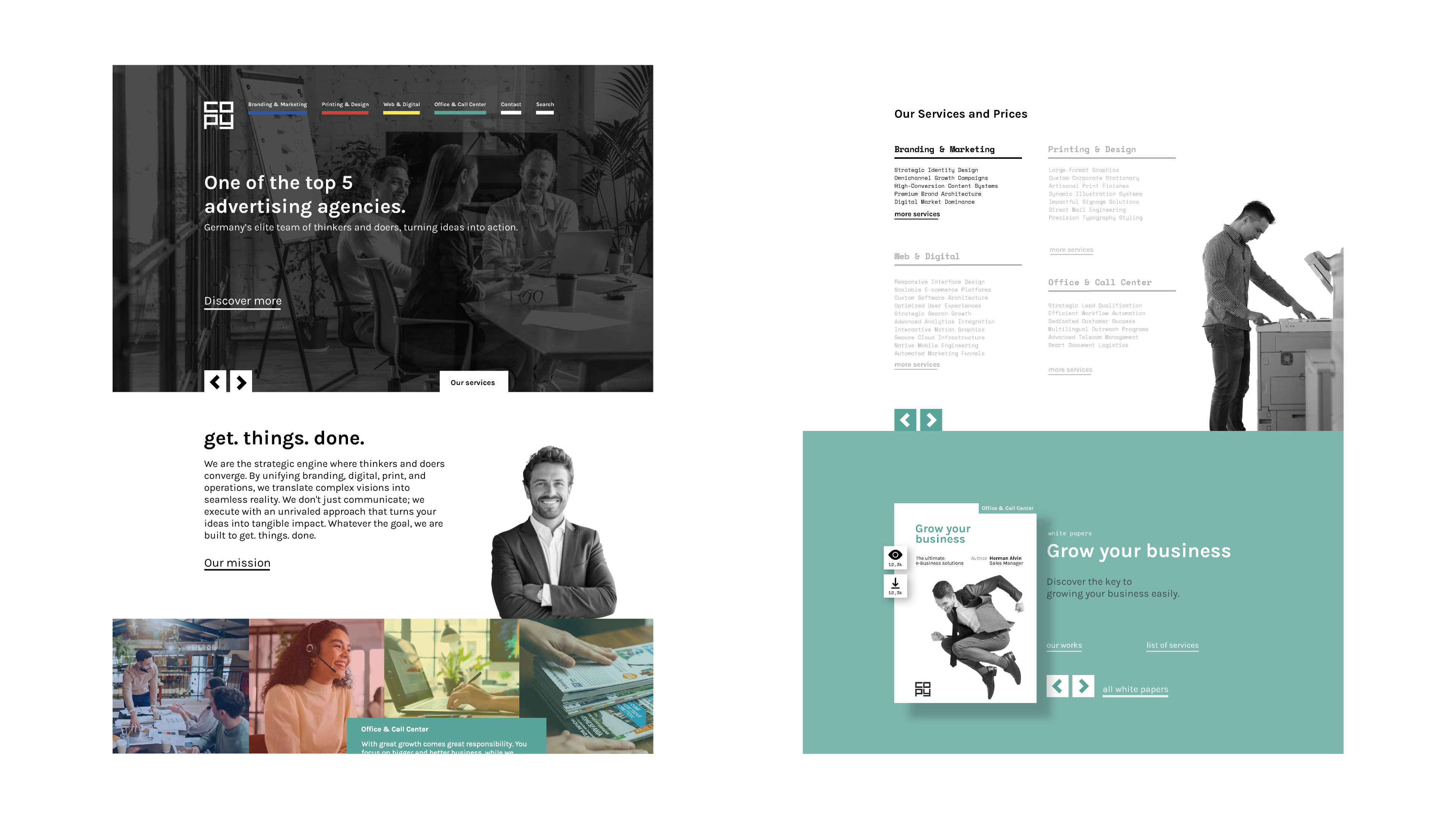
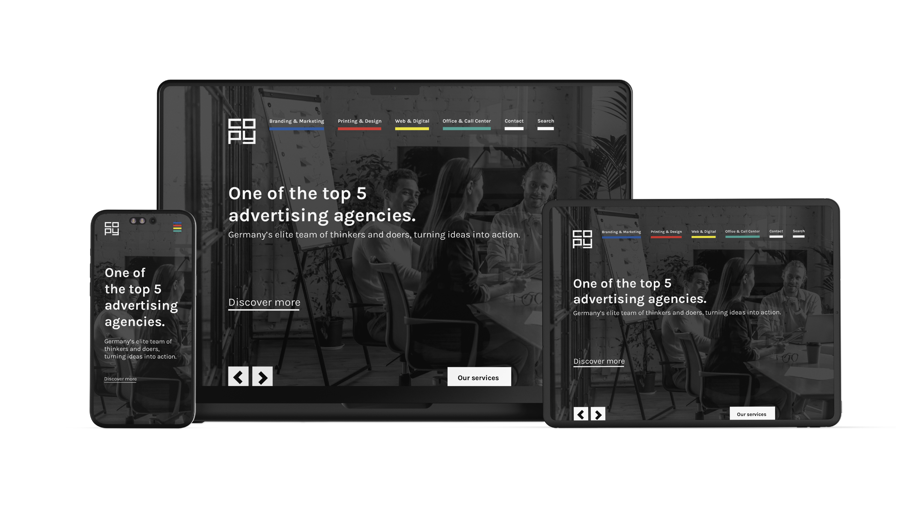
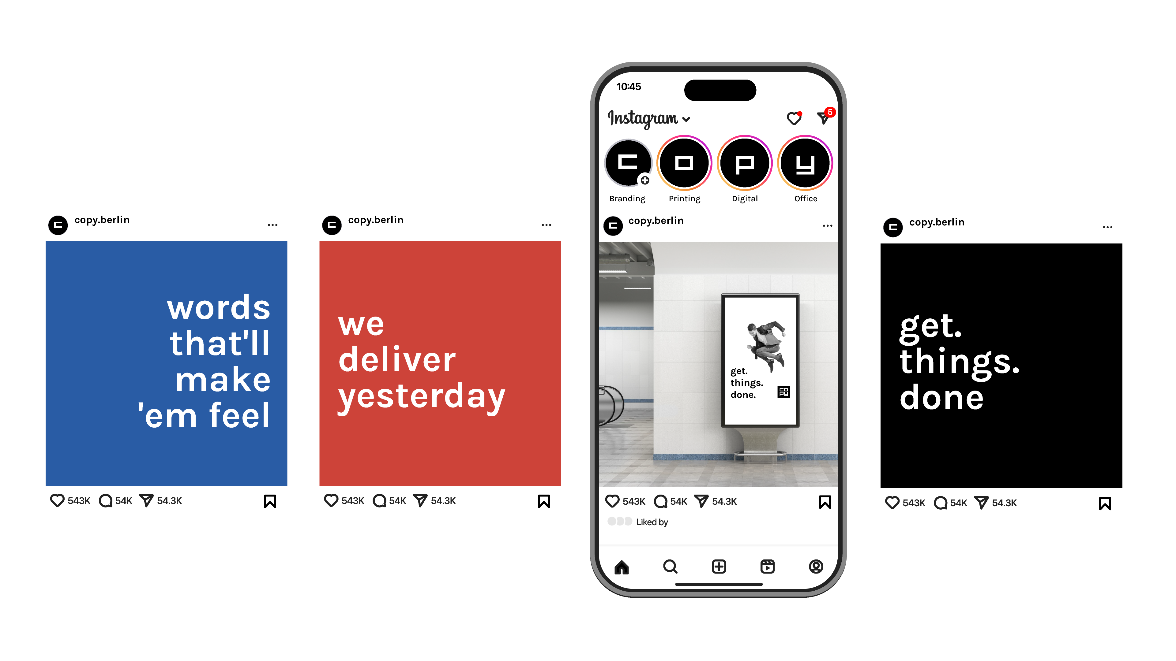
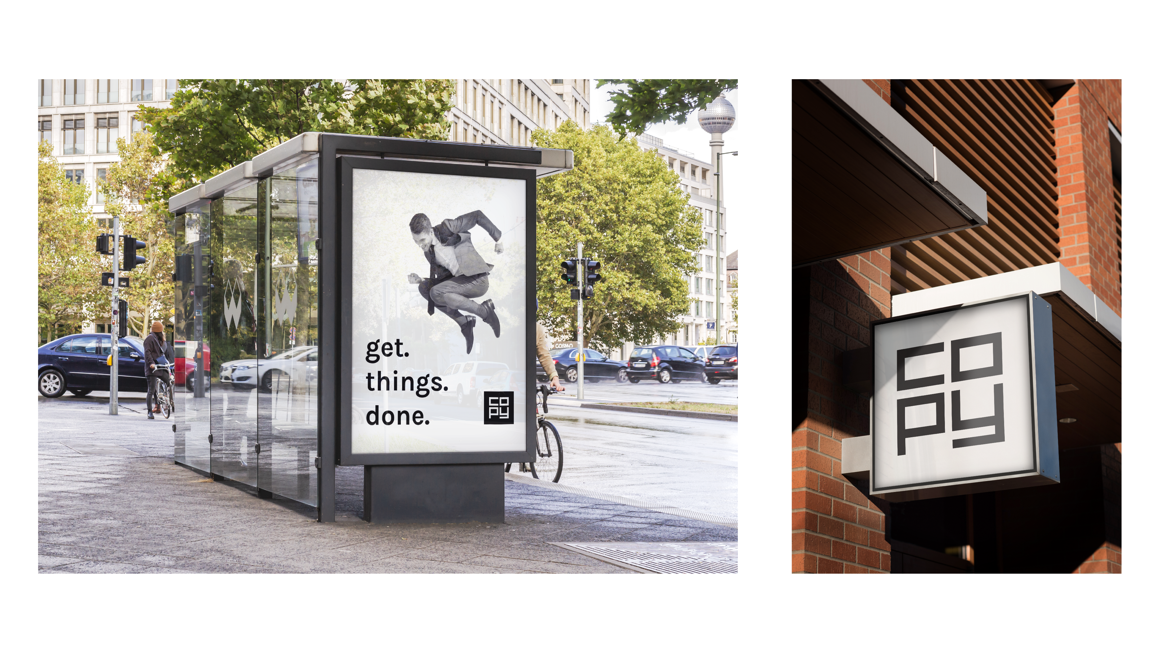
For alpha alpha Copy- und Reproservice's rebranding proposal, I developed a concept centered around their four core services: branding & marketing, printing & design, web & digital, and office. Each service is linked to a color (CMYK is translated to blue, red, yellow, and green), while the company’s overall identity remains black and white.
summer well
record cover design / 2023
The festival, held annually in August at Domeniul Știrbei in Buftea, Romania, inspired my exploration of visually representing the music experience through typographic plays as possible covers for records to be released at every event.
let's do it romania
poster design / 2023
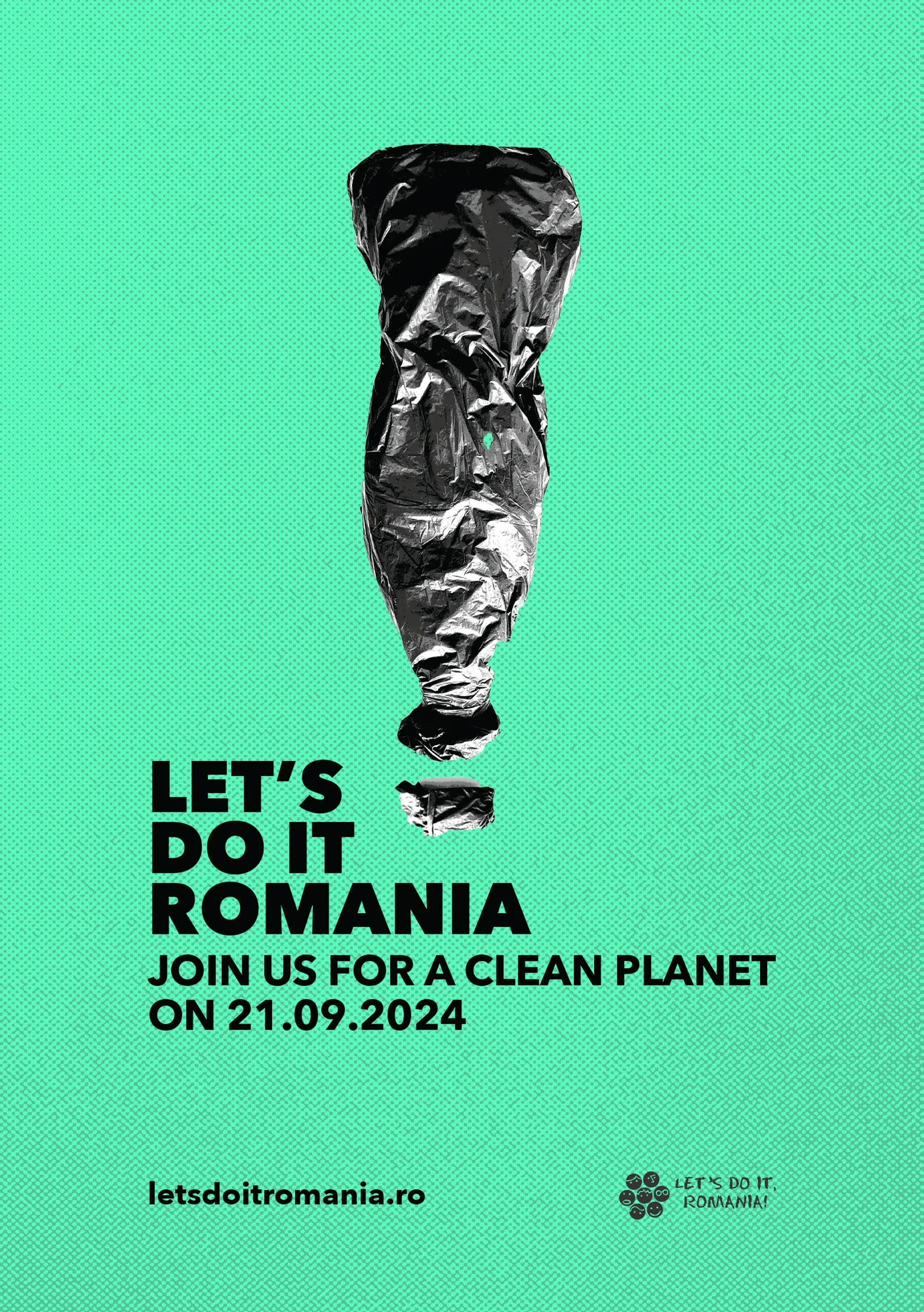
What would we even call it, if not a second chance for plastic waste? An absolute imperative!
Let’s Do It Romania! is the largest movement in the country that has been activating volunteers since 2009 for projects that drive social change. The National Clean Up Day has engaged over 2,100,000 participants, boosting the recycling rate from 17% to 45%. For the proposed campaign poster, I utilized real materials to adress the issue of plastic waste.
van der rohe
poster design / 2023
Inspired by my research into Mies van der Rohe's architecture and the MoMA exhibition Transparency in Architecture and Beyond, I designed a possible poster for the exhibition at the Neue Nationalgalerie, which embodies the best the theme.
The poster integrates two key elements of van der Rohe architecture: transparency and the grid. Using a monospaced typeface Matter SQ Mono TRIAL, I created the grid pattern. The concept of transparency invites viewer interaction; by peeling off sections of the poster, they uncover the message.
simple facts
brochure design / 2023
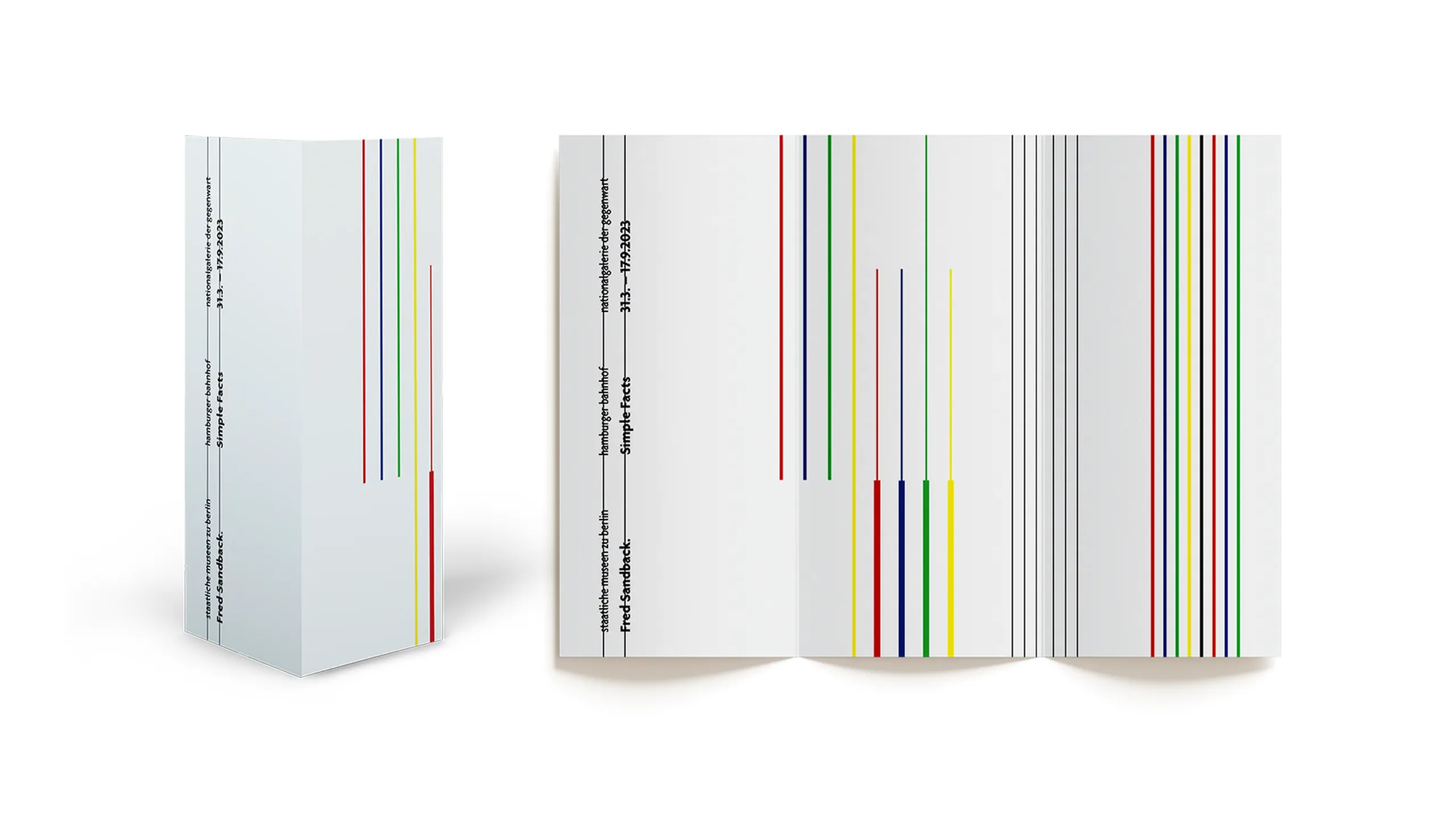
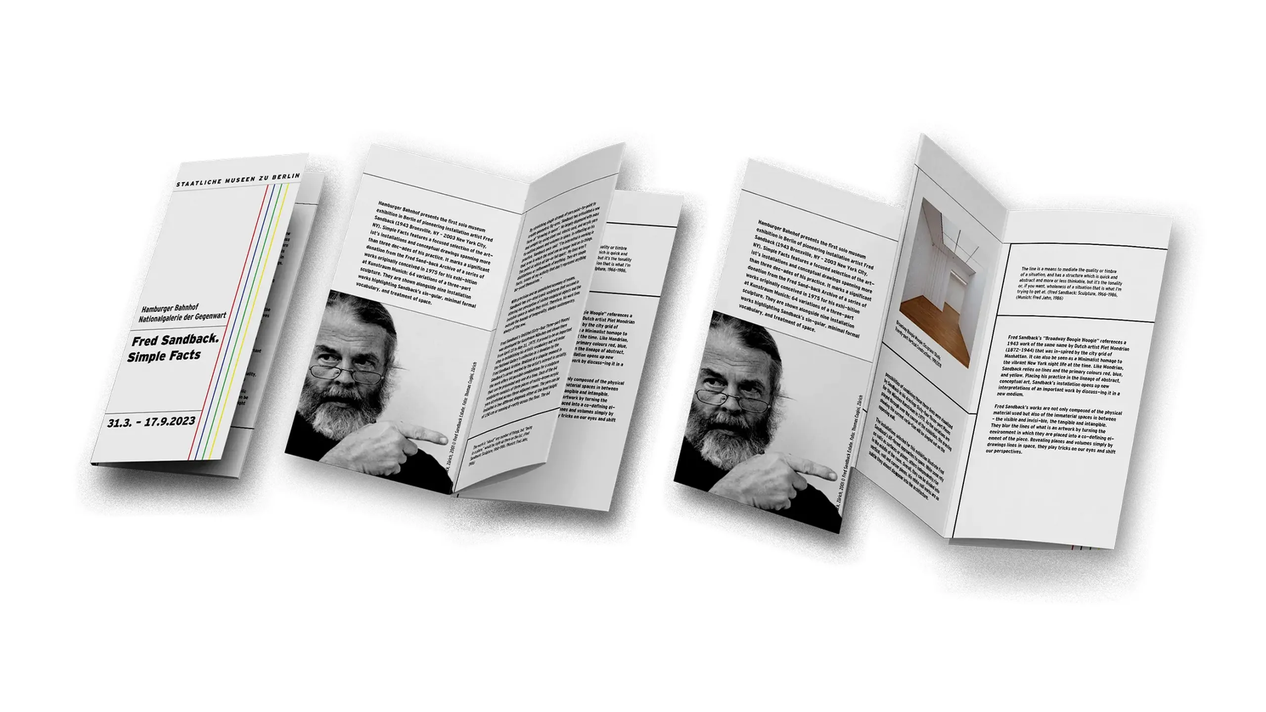
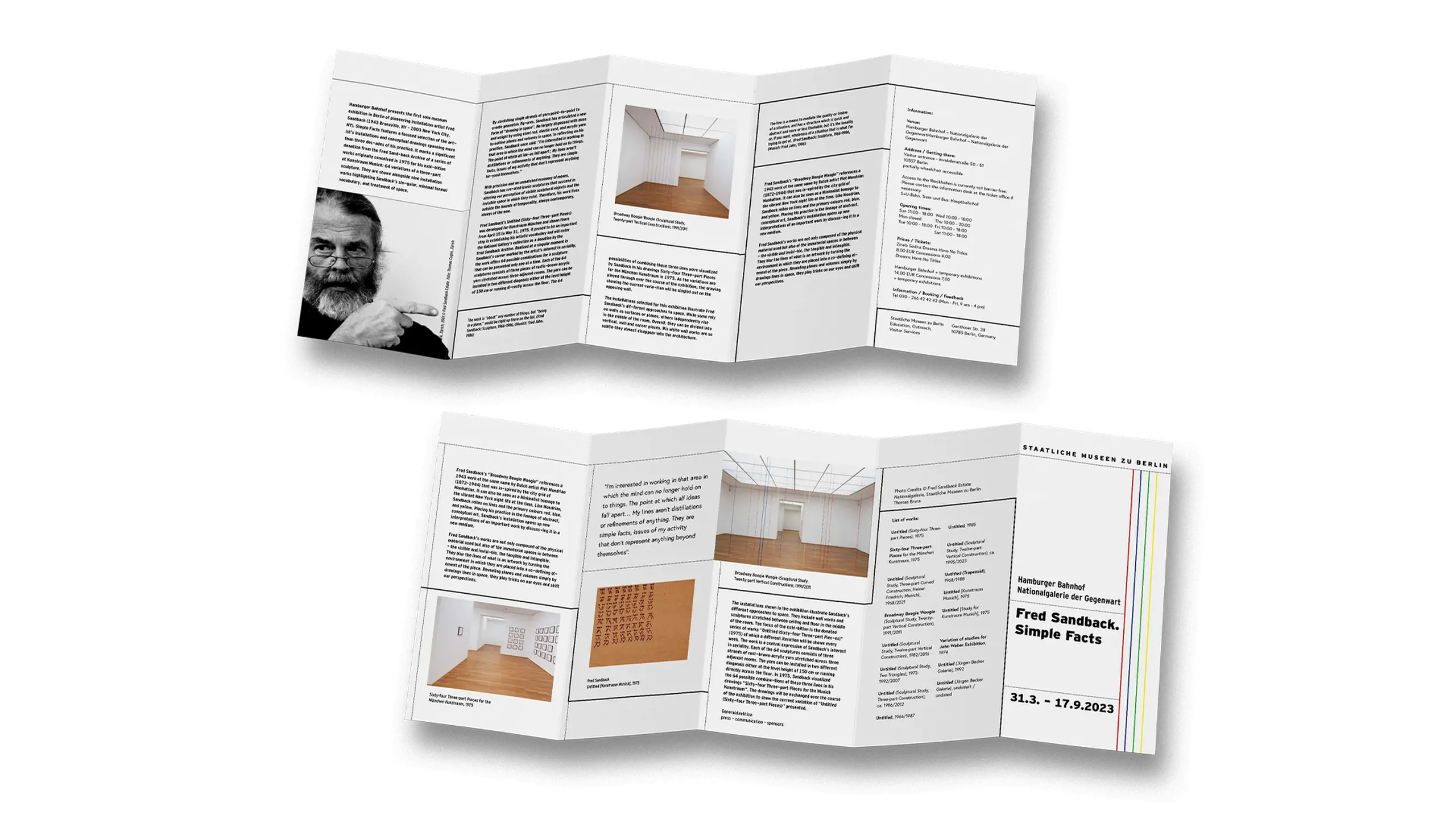
Visiting Fred Sandback's exhibition was challenging: as minimalist as the artist’s installations were, there was so much emptiness to fill with thoughts, reflections, and questions.
The key principles in designing the brochure were: parallels as accompanying possibilities, ground as a place to step into, a place on which to stand, and a place from which to step out, and silence — out of which emerge unearned answers.
In light of this, I came up with the concept defining my vision of the exhibition and the brochure: accompanying possibilities — on questioning their depth, realized in two forms using lines as a reading guide and compass, the first one on a plain layout while the second employs volumetry.
carturesti
business card design / 2023
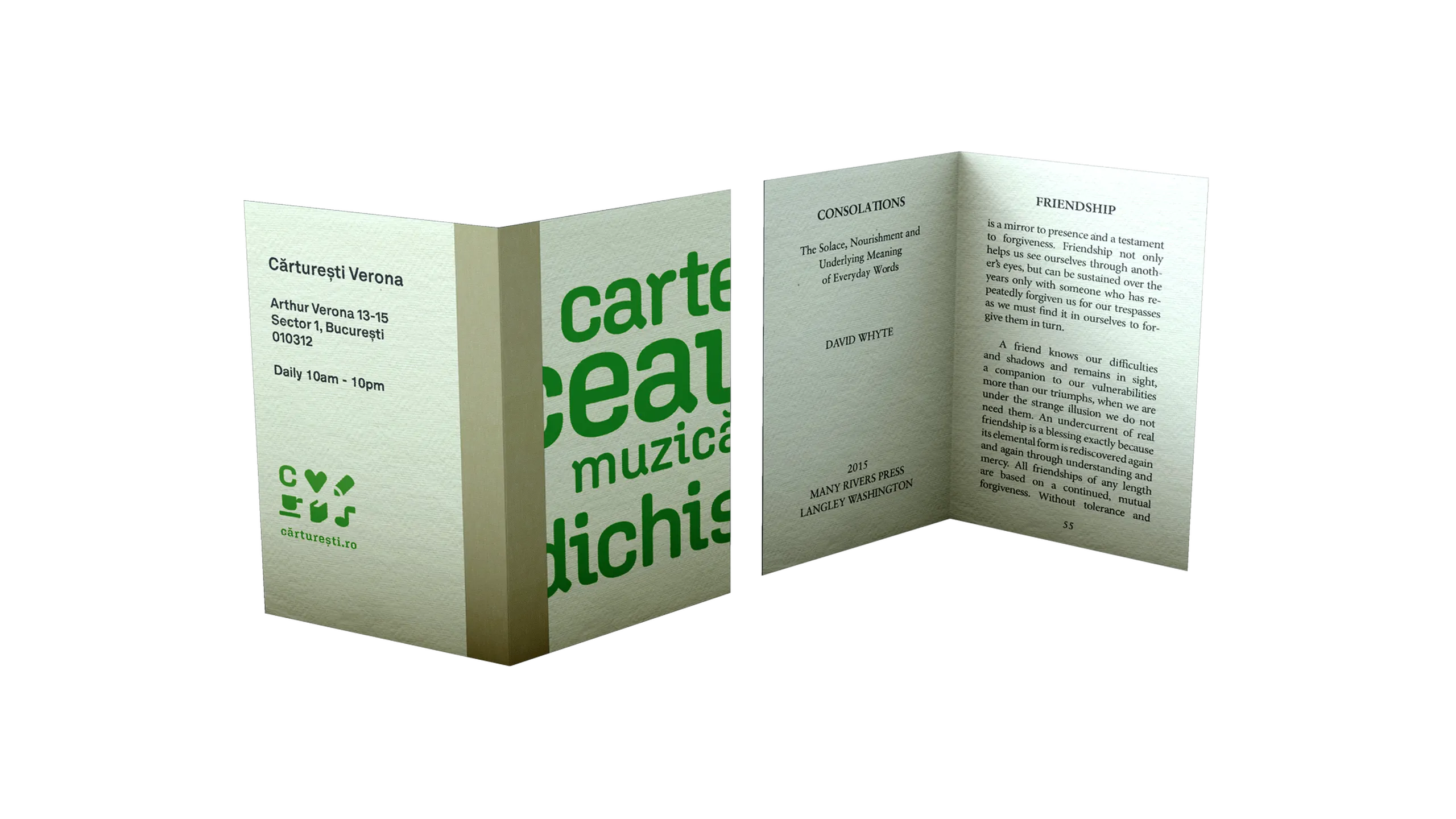
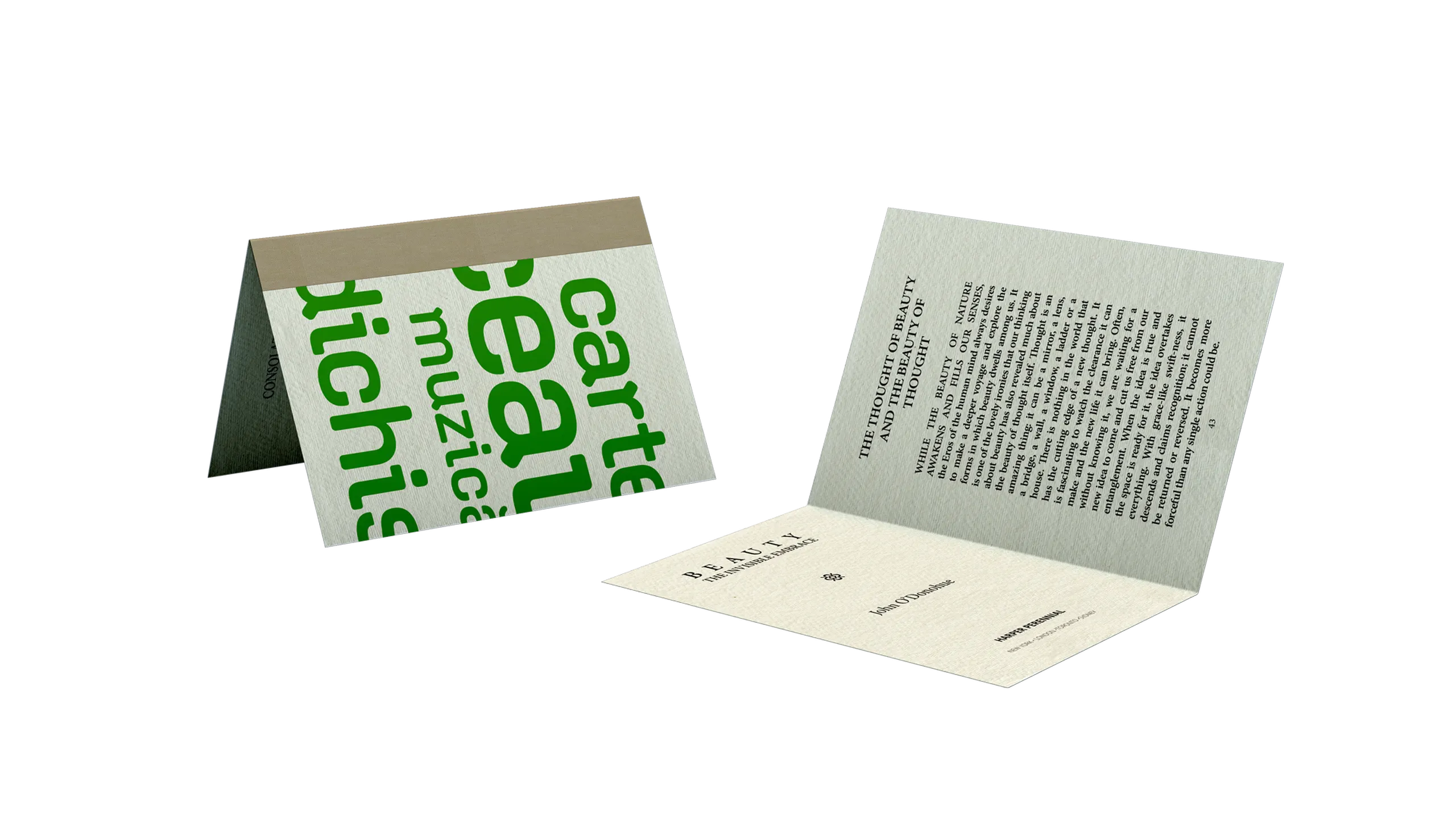
Carturesti is a beloved bookstore of mine I always visit whenever I'm in Bucharest. It is the meeting point for lovers of books, tea, music, and fancy things, with everything from the latest translations to rare book editions, from childhood games to the craziest toys, from watercolor paper to drawing tools, from classic films to documentaries or from CDs to vinyl.
The goal of the proposed mini-book business card was to promote books, best-sellers, and awarded titles. The card has on its covers the bookstore's slogan and contact details, and the title page and an excerpt of the promoted book on the inner pages.
sabon
type specimen / 2022
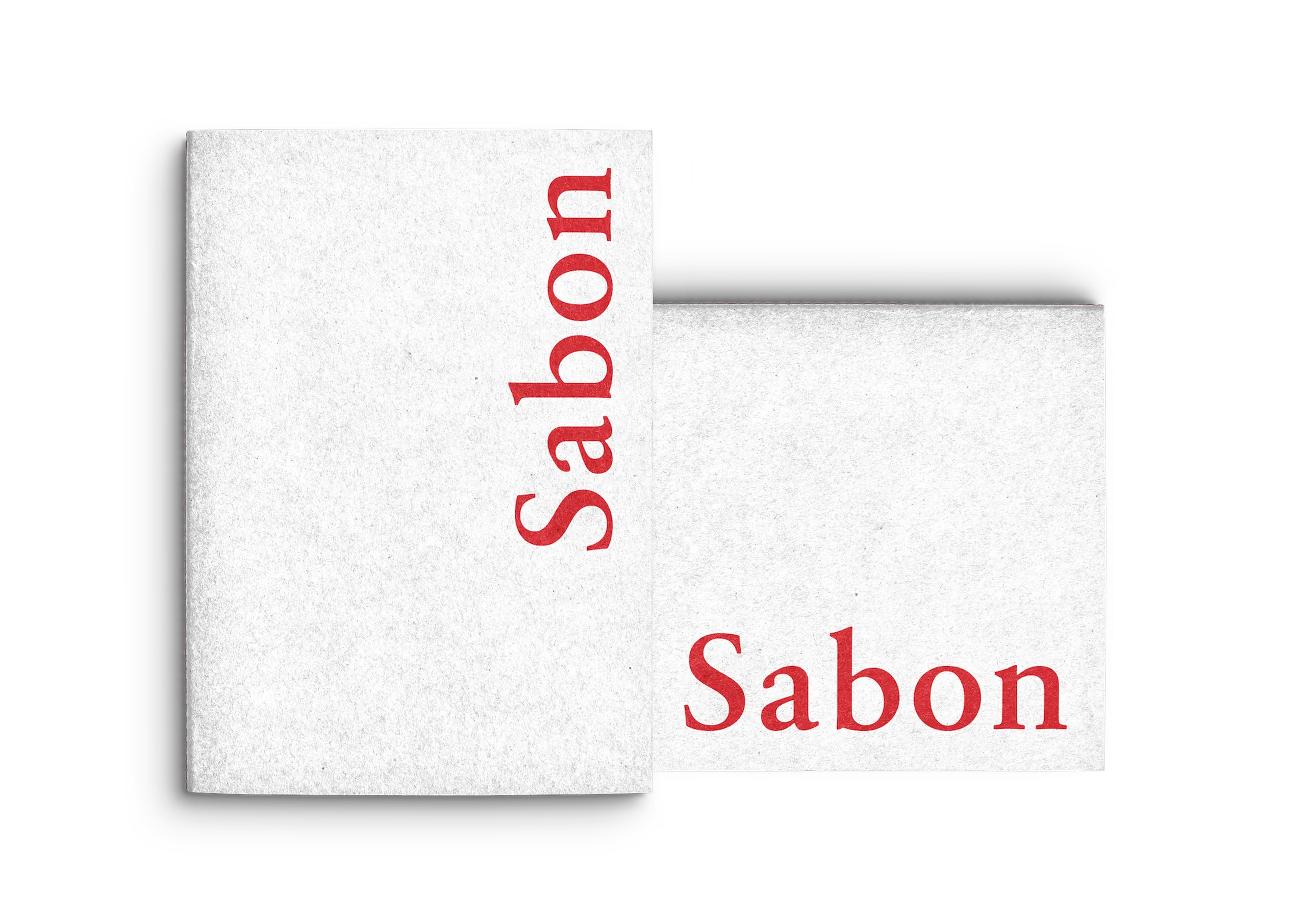
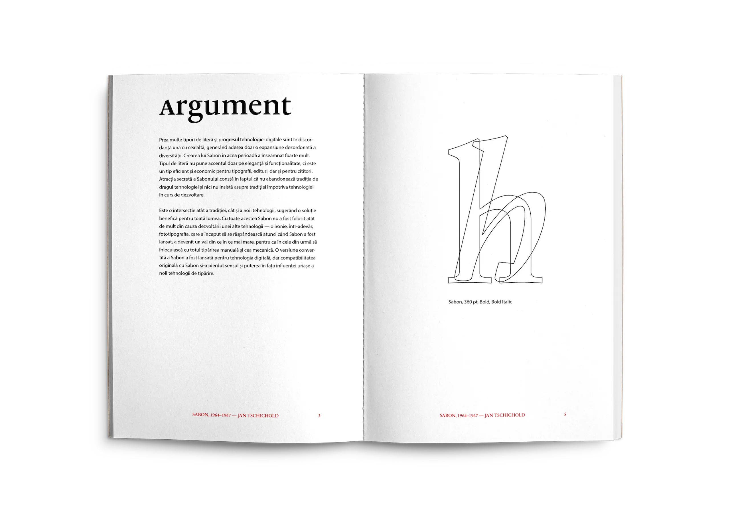
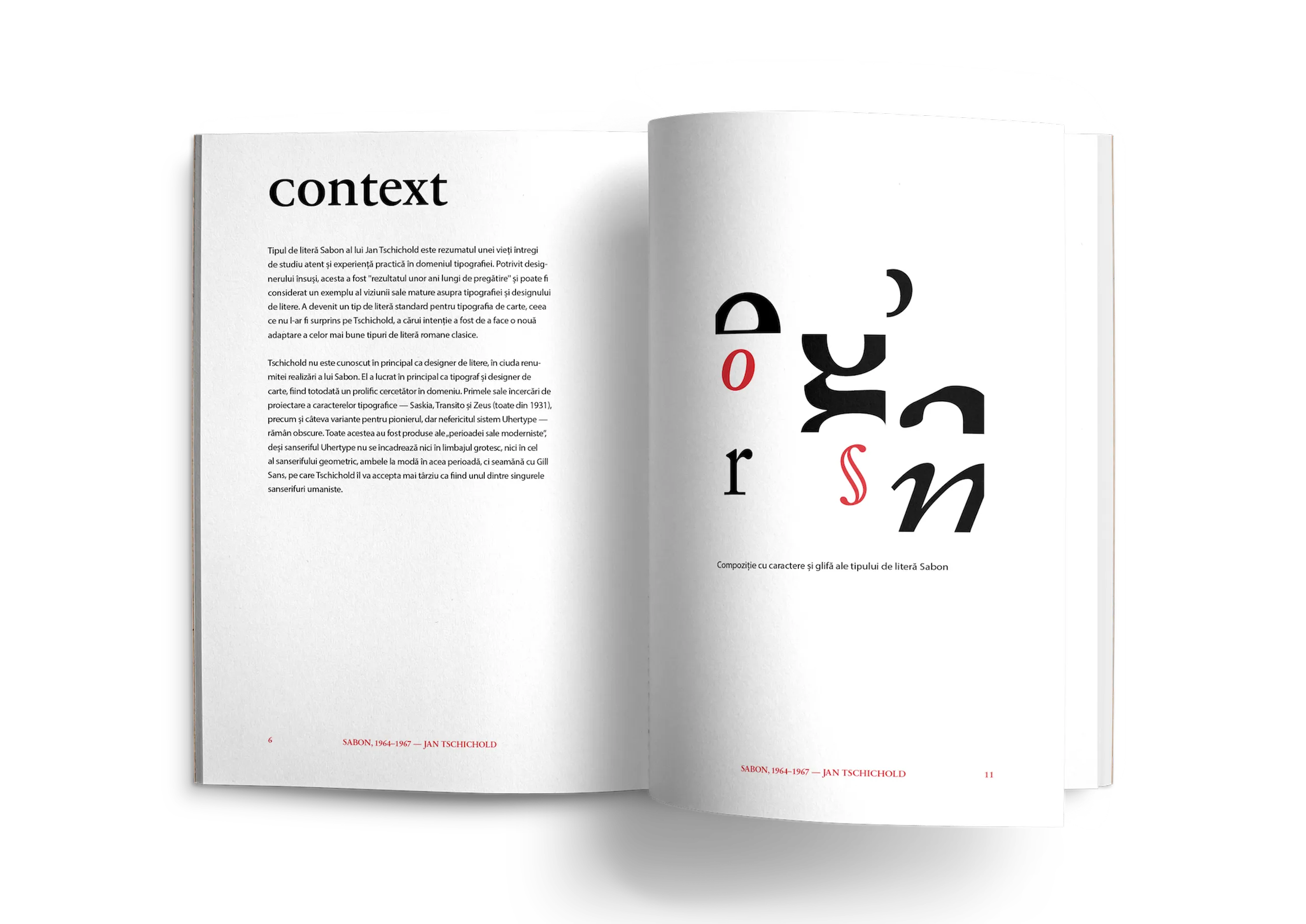
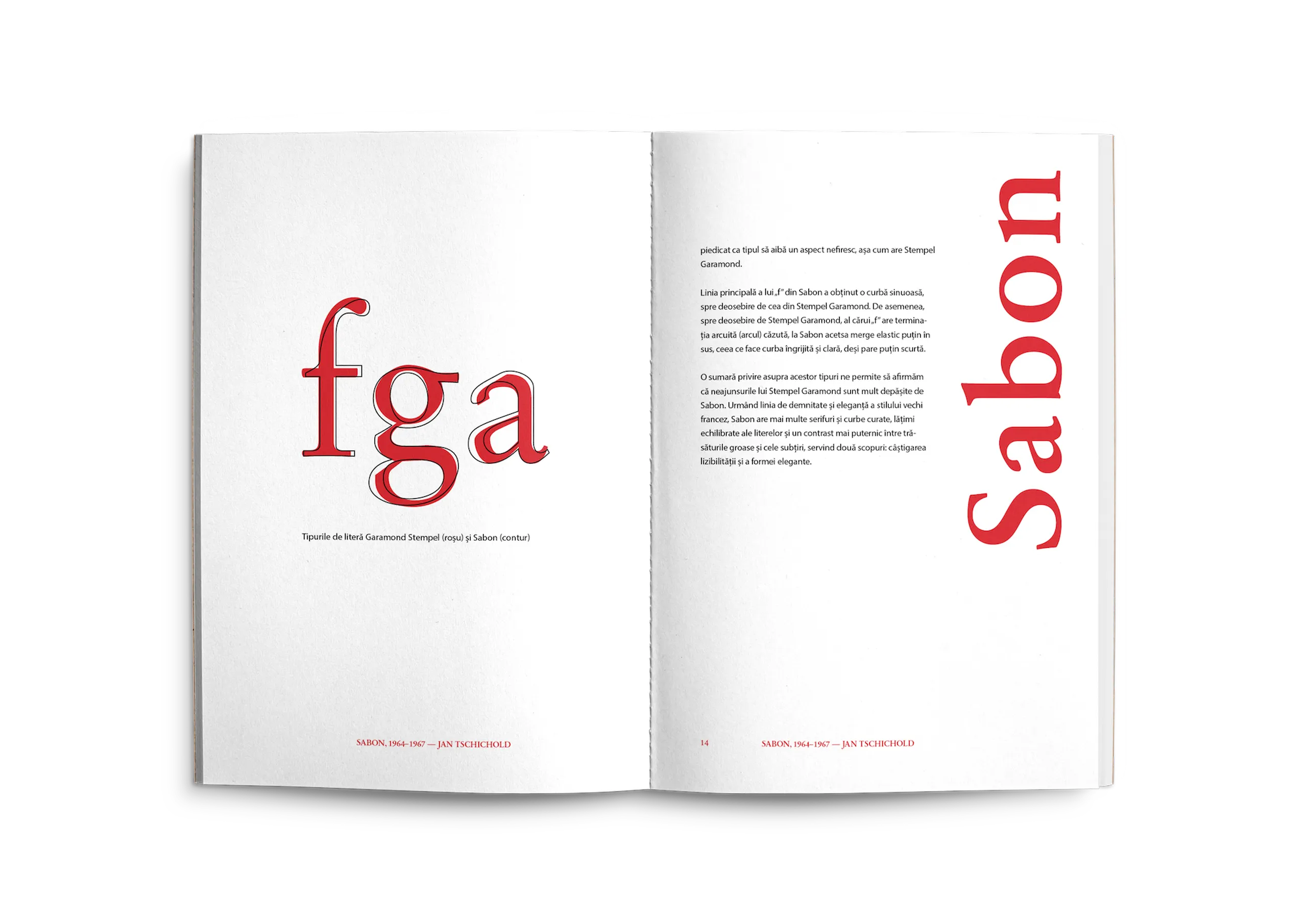
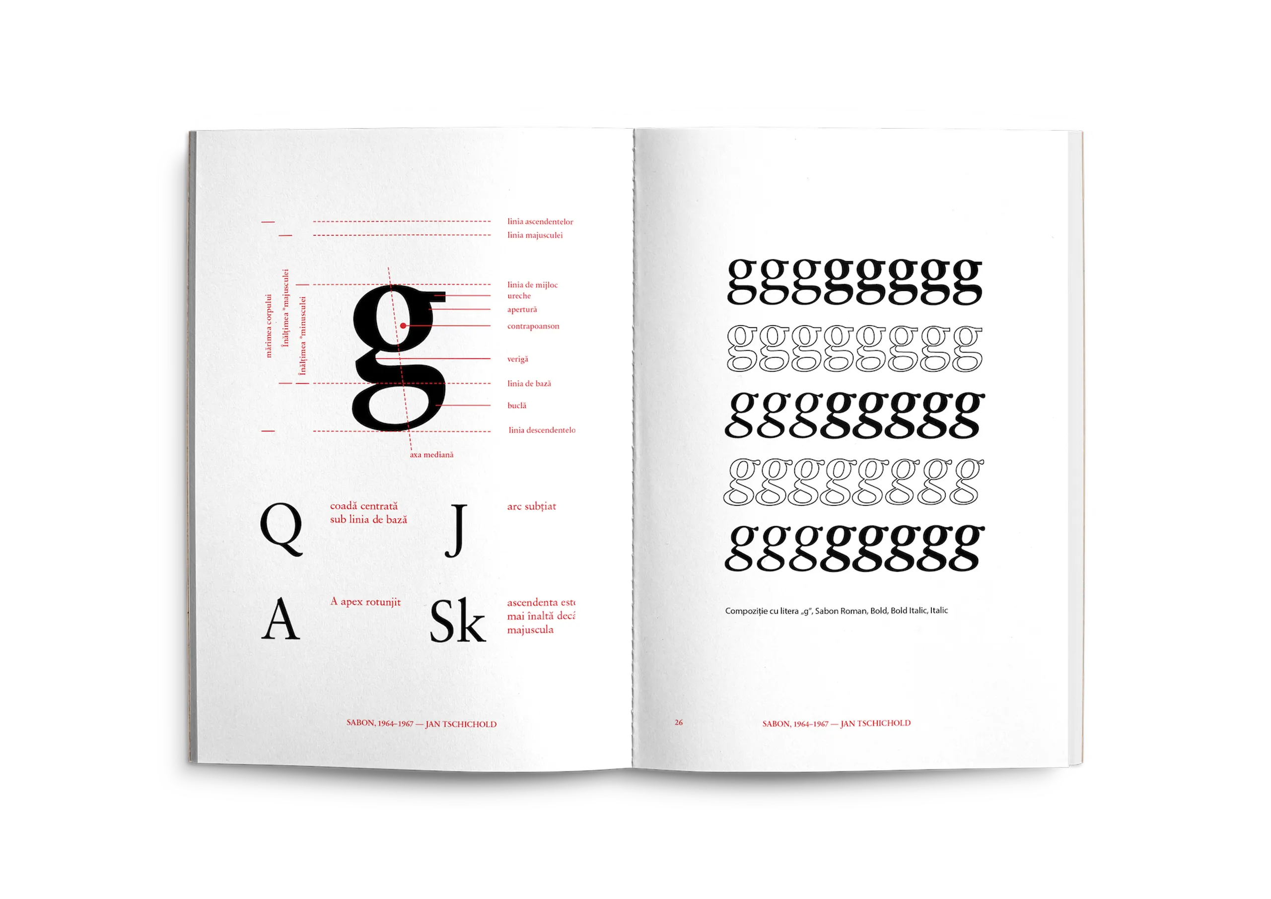
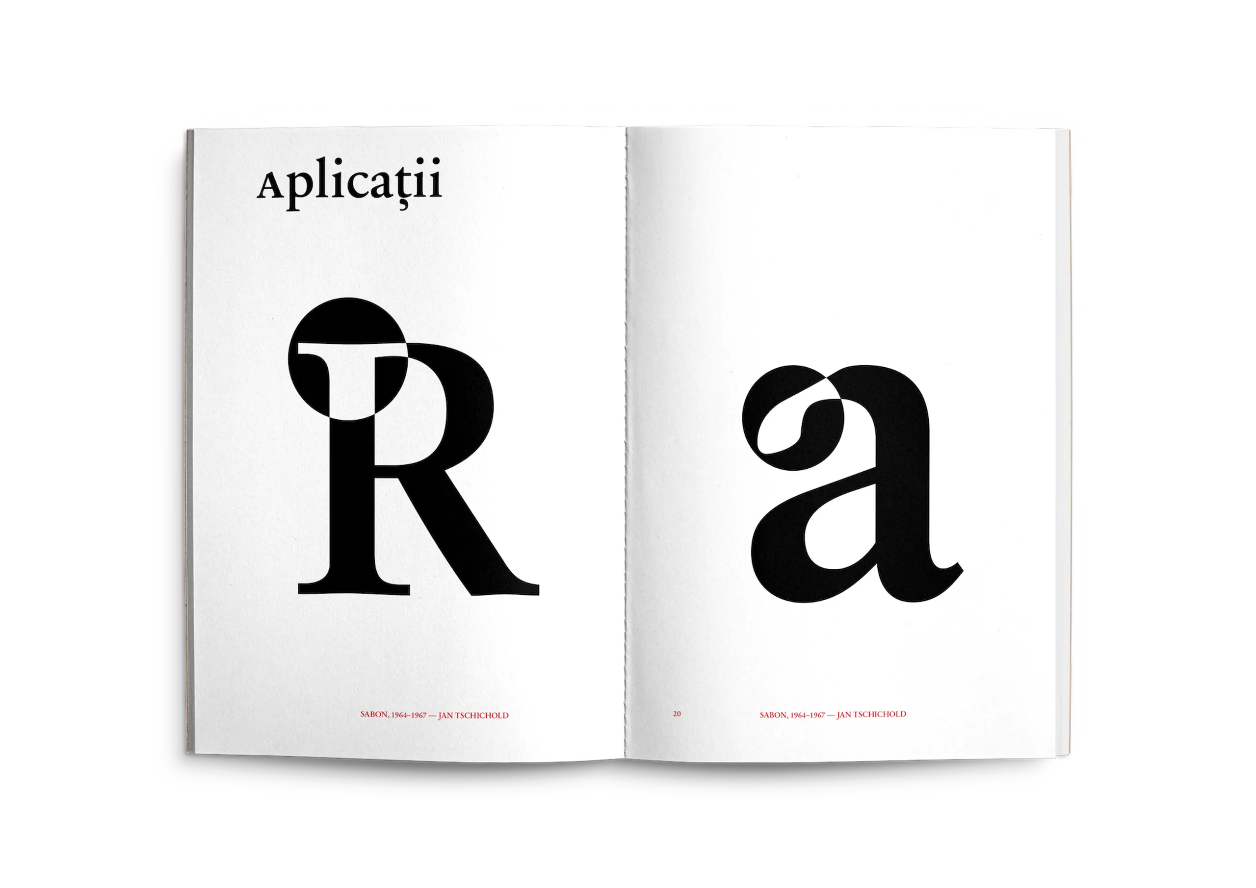
Jan Tschichold was the graphic designer from whom I learned what it meant to devote a lifetime to a typeface. It is impressive that a man who had spent his career advocating for modern types (by modern I mean sans serifs) had returned to a classicist theory in which centered designs and Roman fonts were preferred for blocks of text.
According to the designer, Sabon was "the result of long years of preparation." I created the following type specimen (some excerpts presented here) to express my admiration for its beauty and functionality.
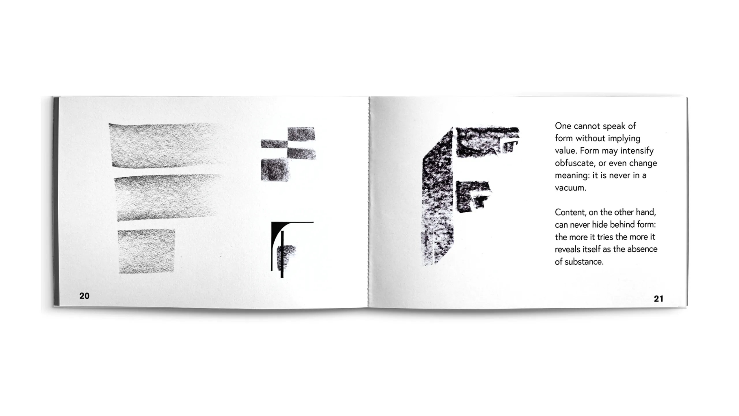
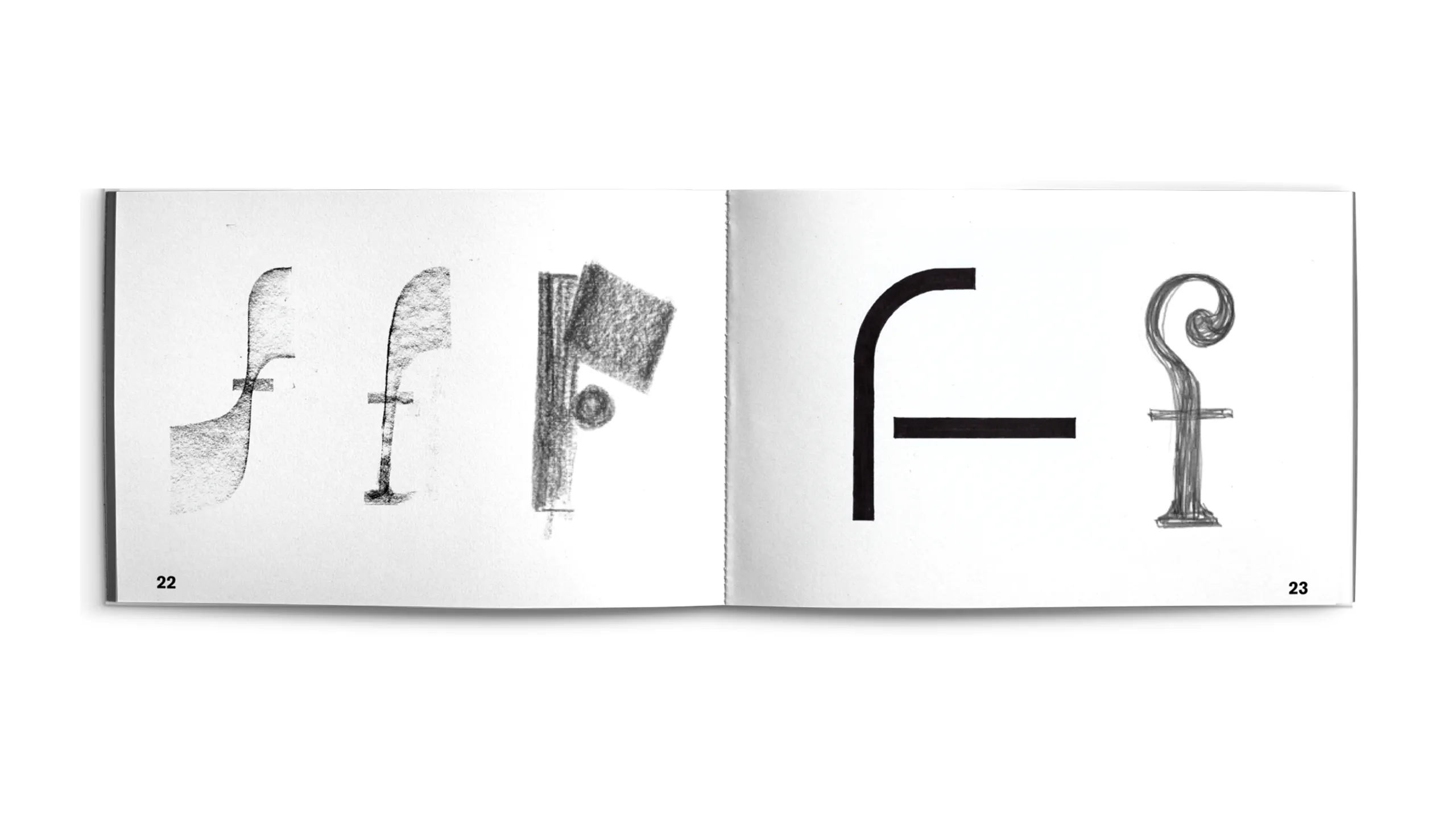
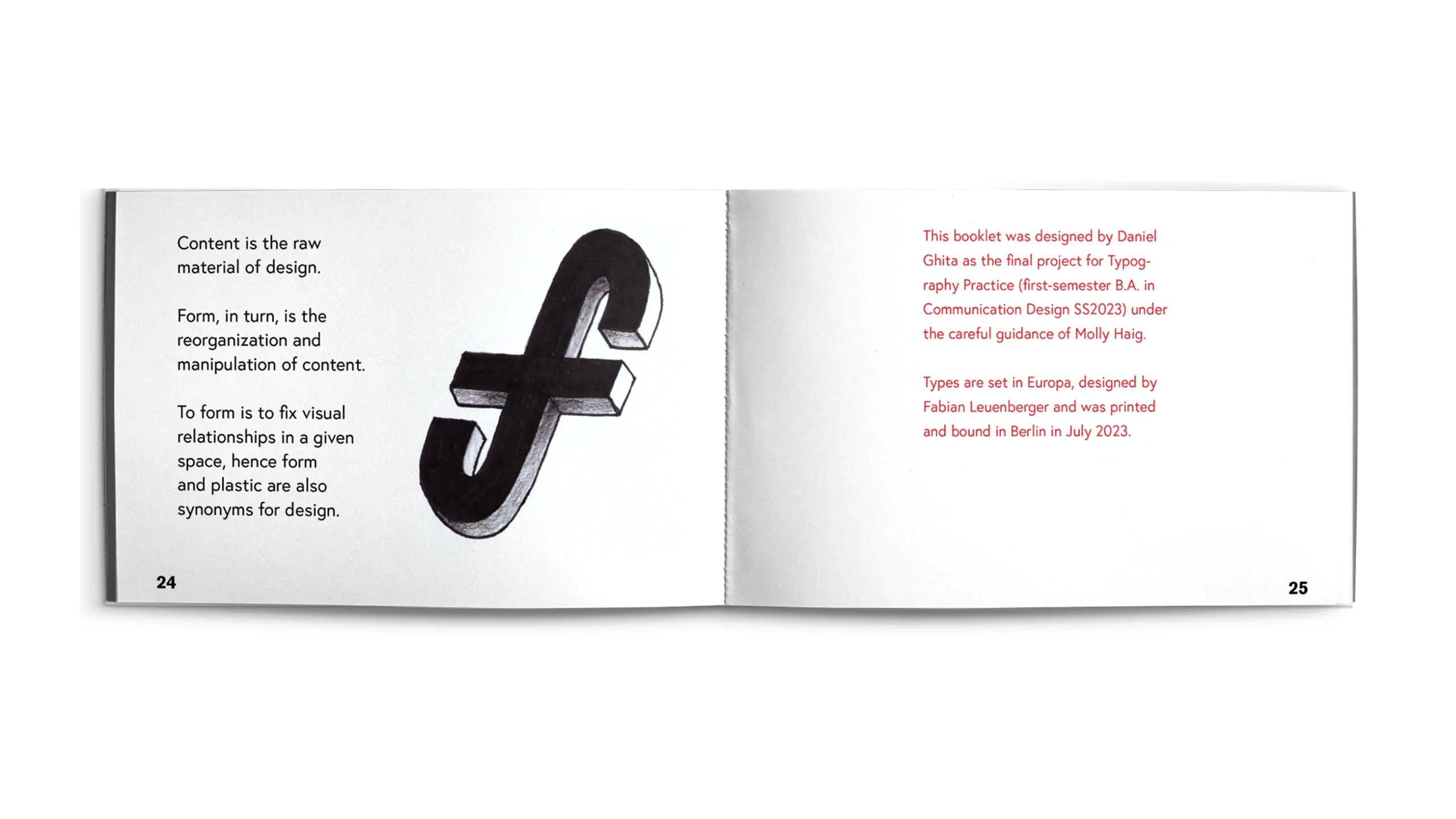
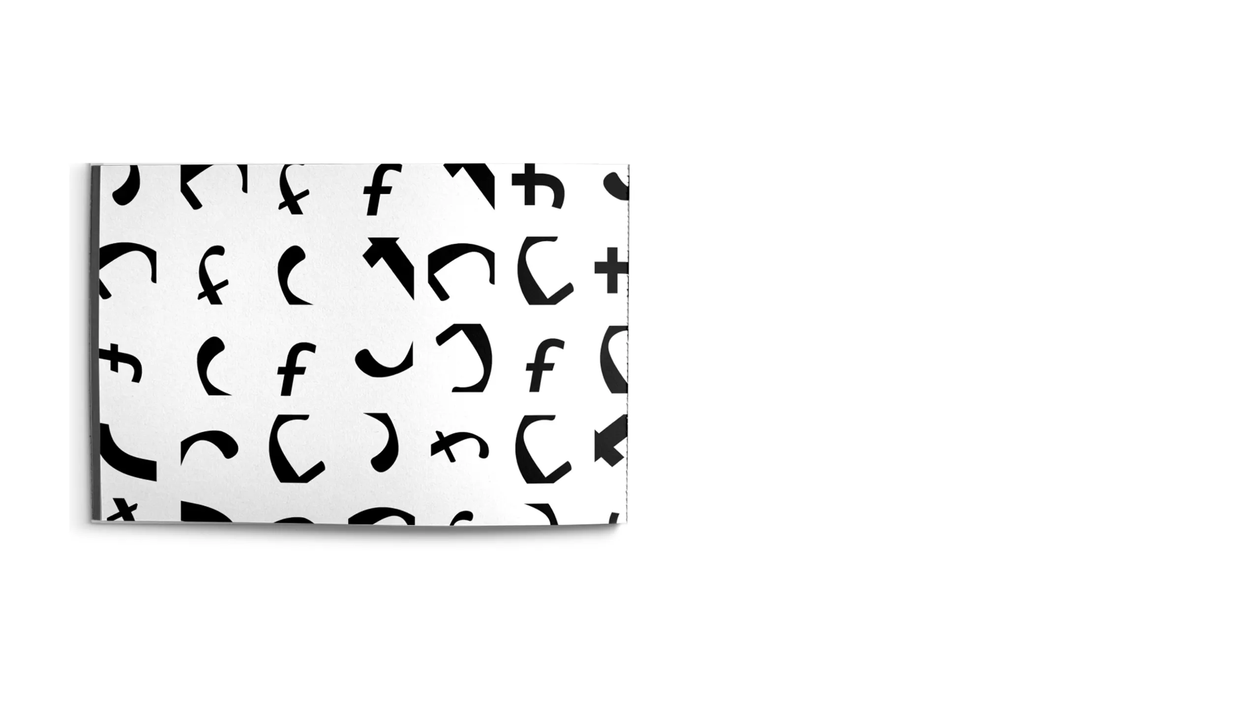
glyph obsession
typography practice / 2023
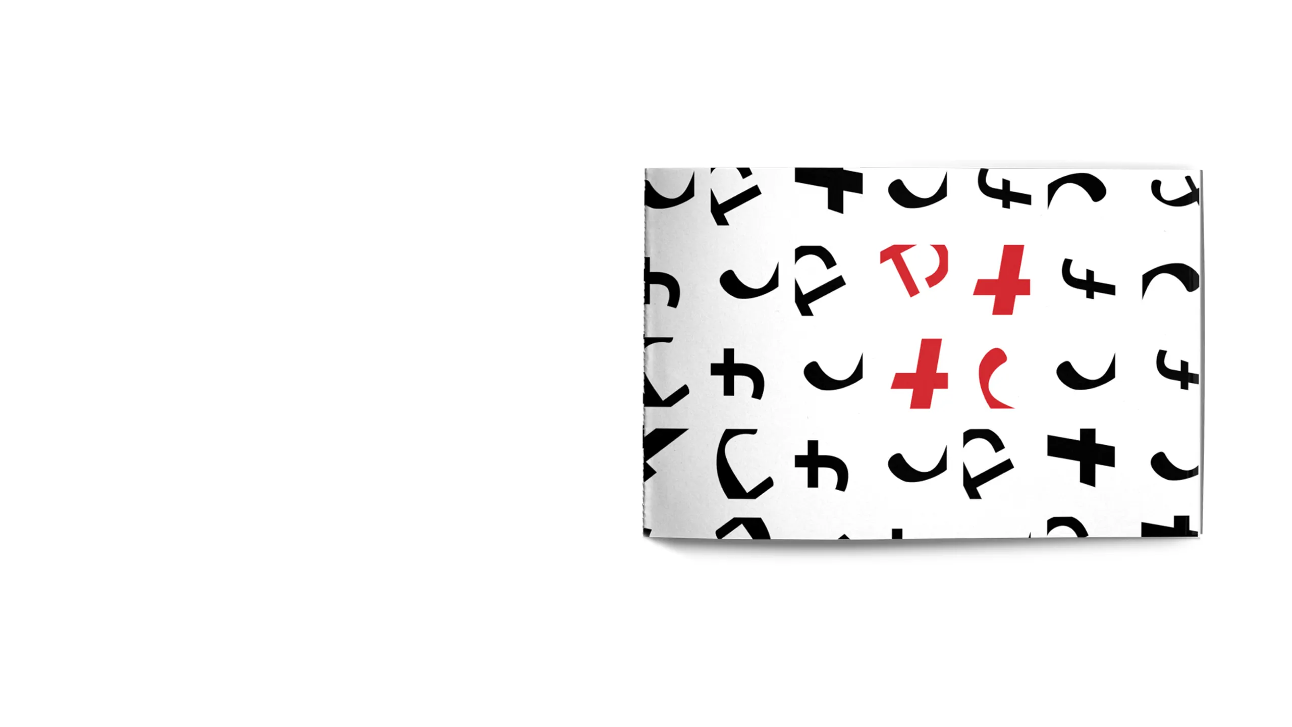
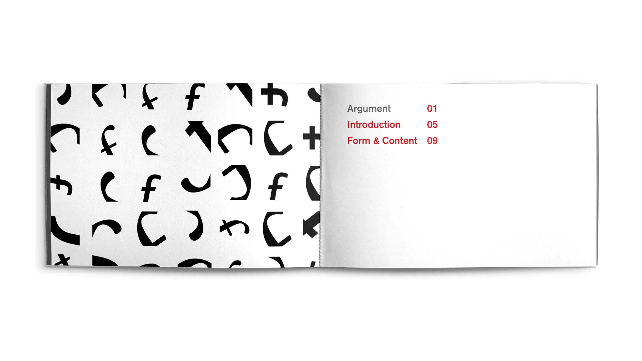
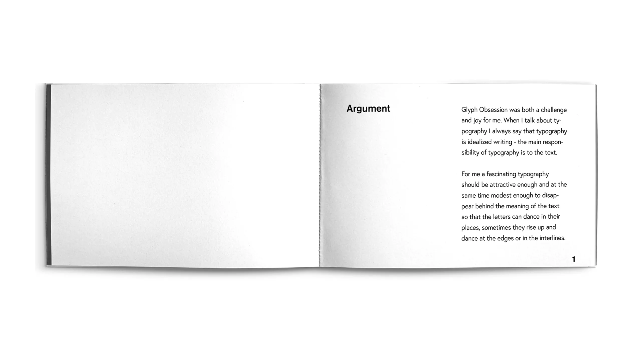
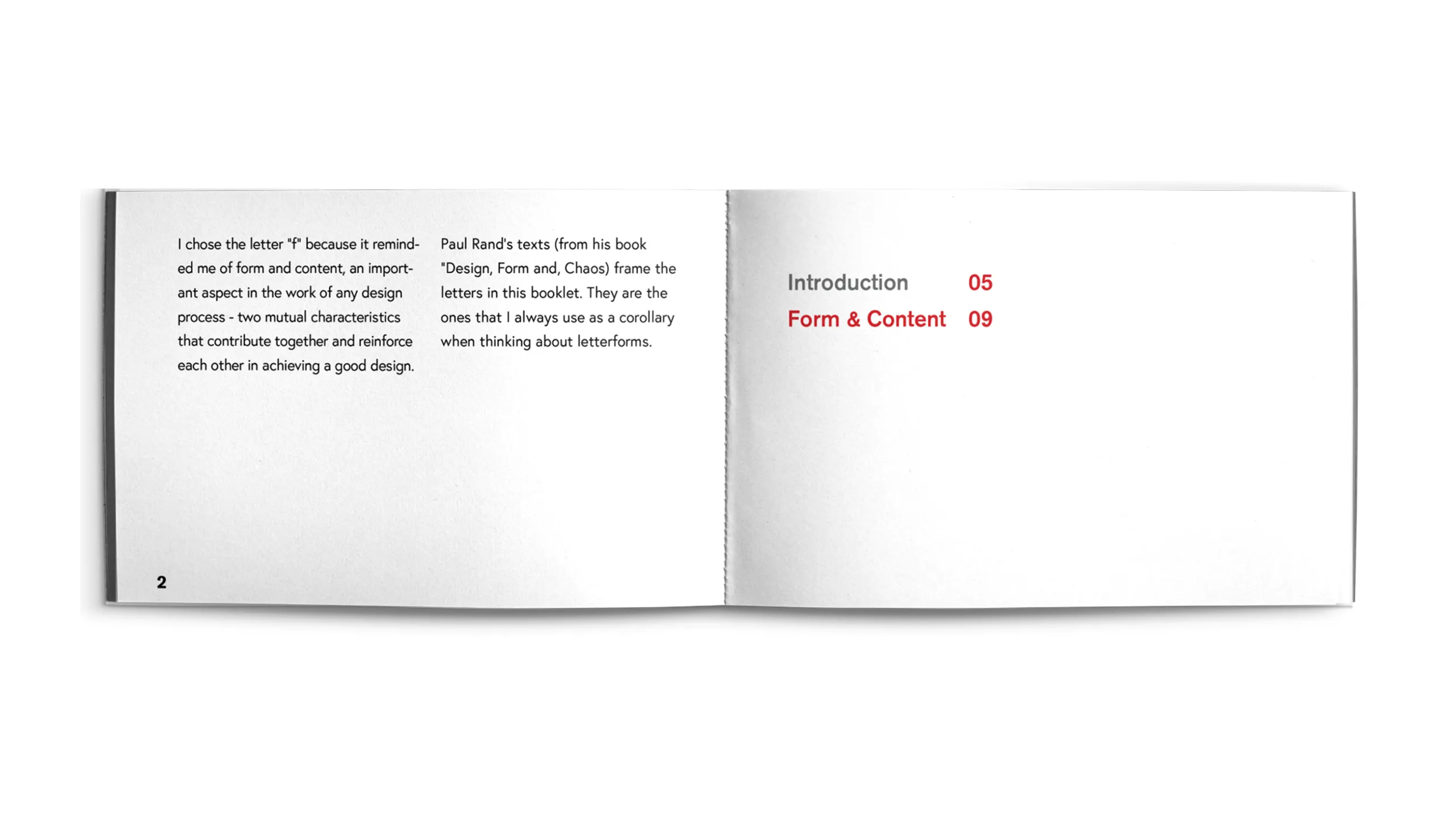
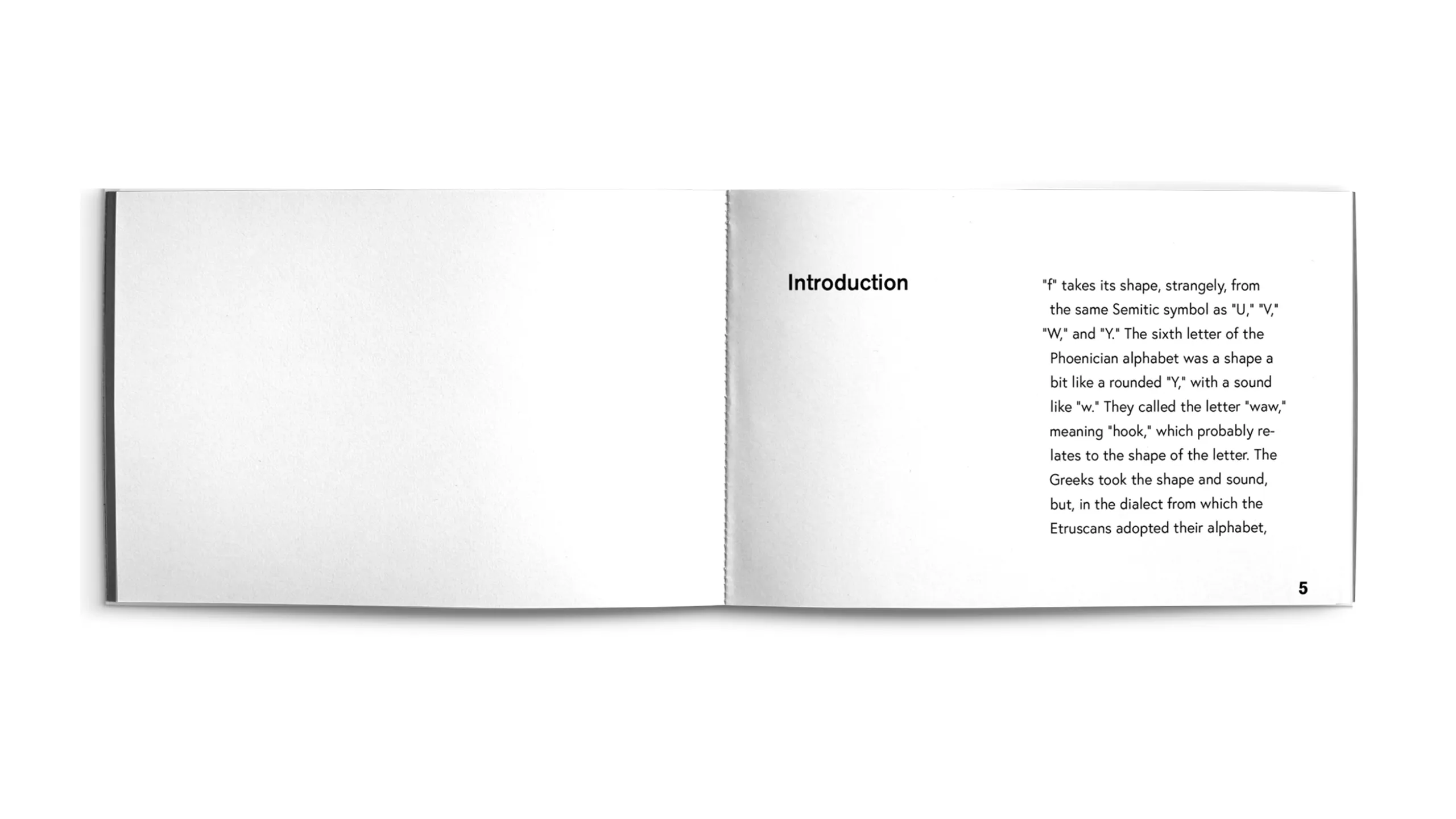
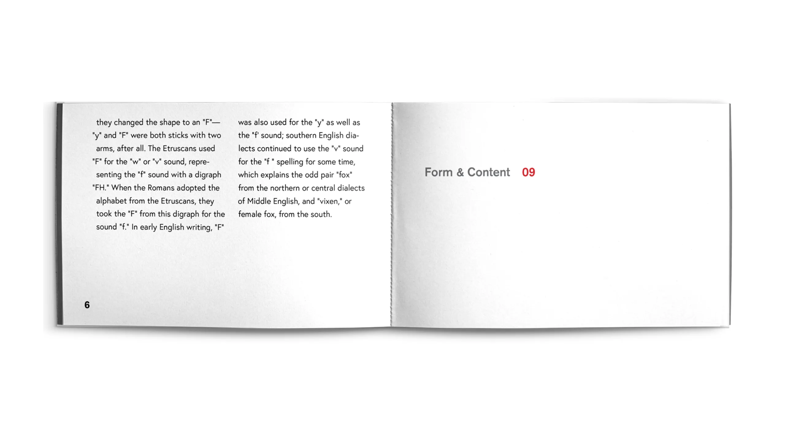
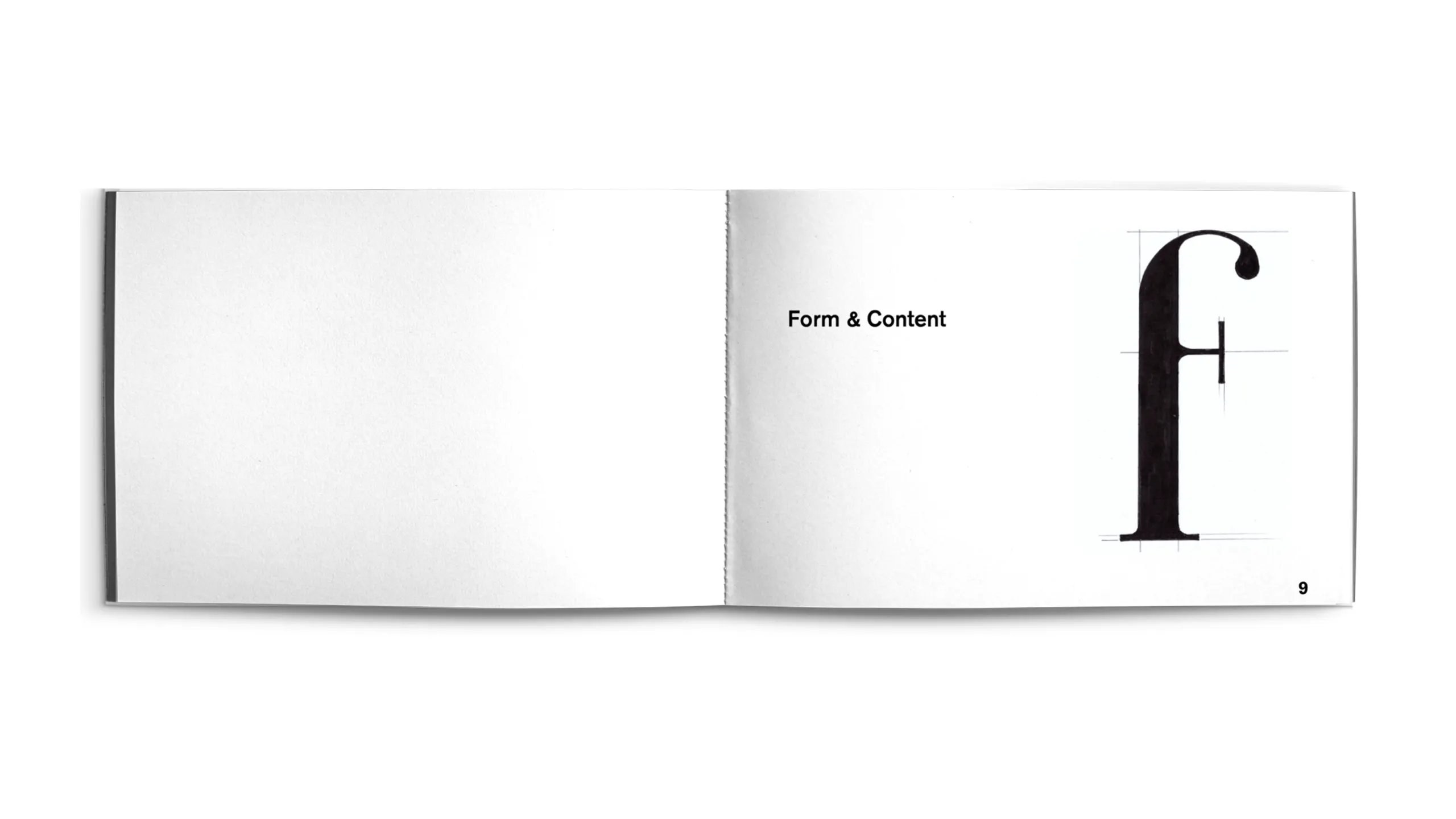
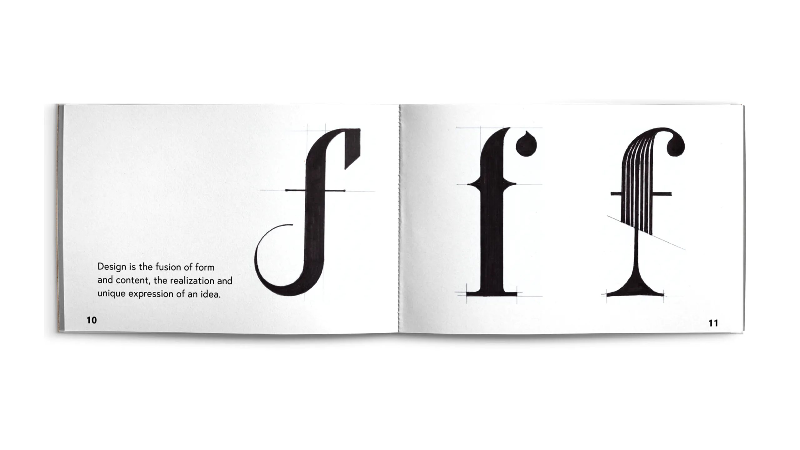
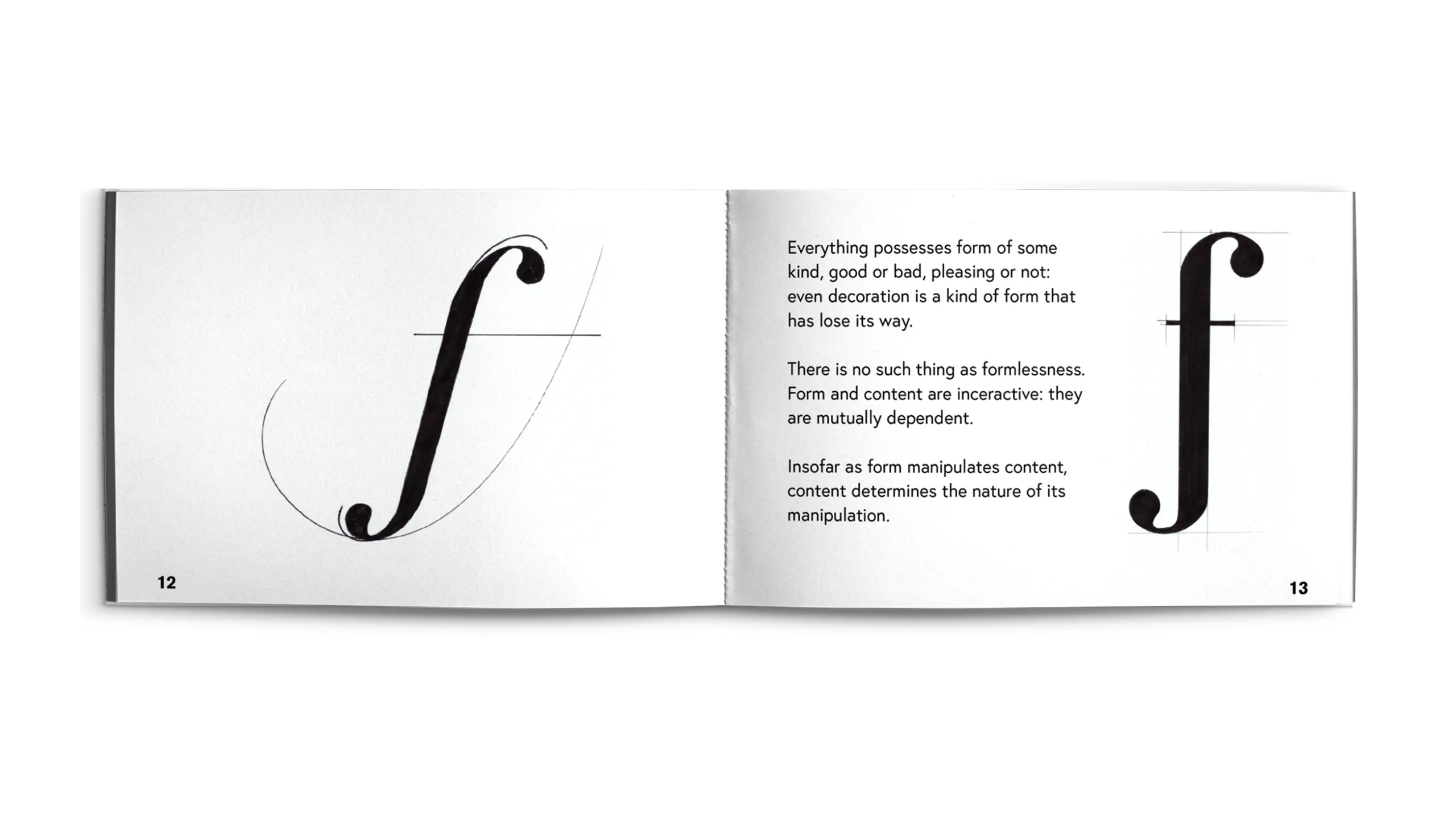
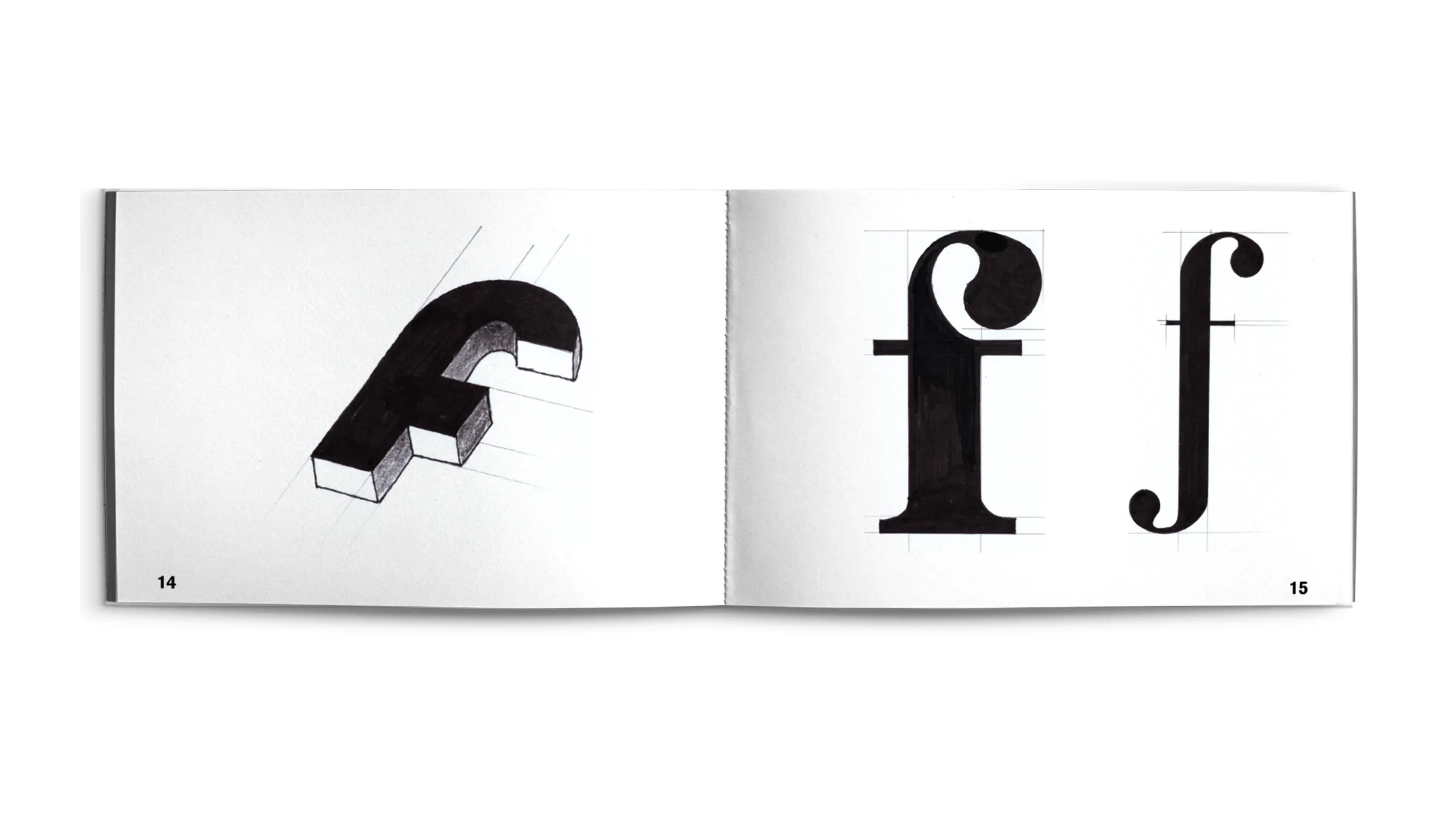
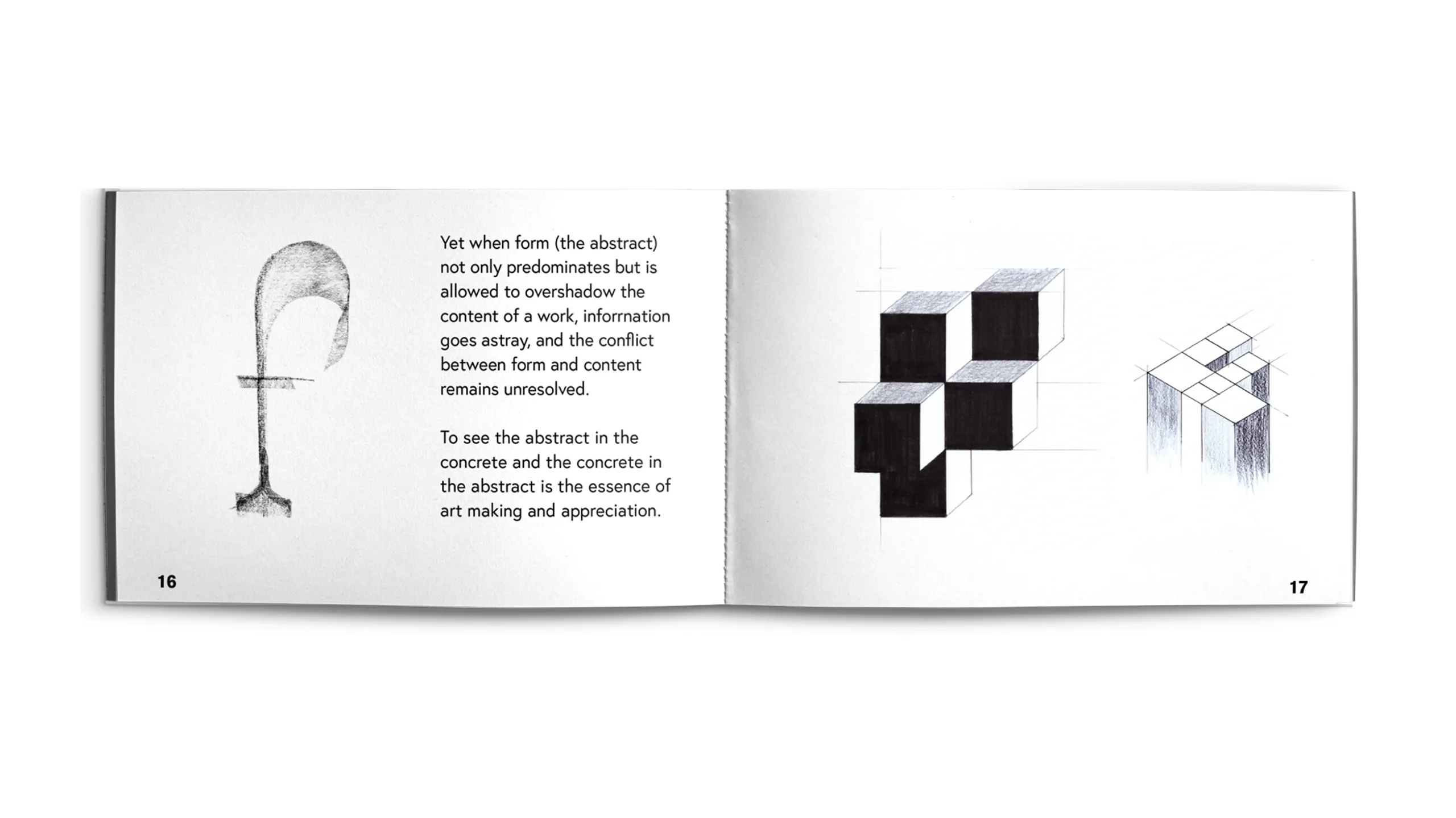
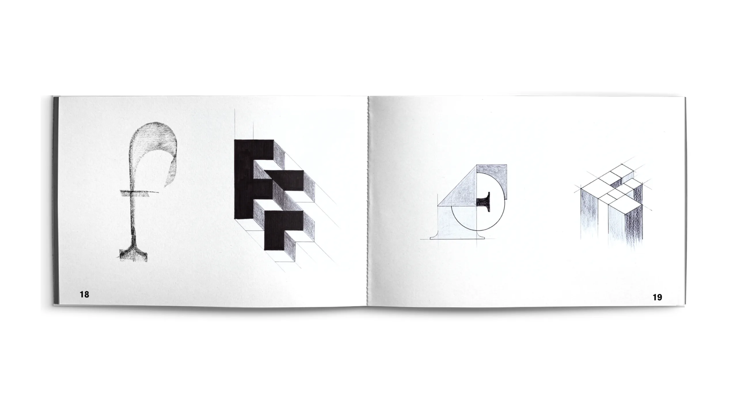
"f" makes me think of form and content, two essential components of any design process that complement and reinforce one another to produce high-quality designs.
For this booklet* the types are set in Europa (by Fabian Leuenberger).
* excerpts from Paul Rand's book Design, Form, and Chaos, chapter "Form + Content"
fenton
type setting, typography / 2022
Fenton is an attempt of a universal alphabet, built on a fixed rectangular and circular grid system. The goal was to design letterforms that respect the geometric constraints while trying to retain the harmonious features of the strokes.
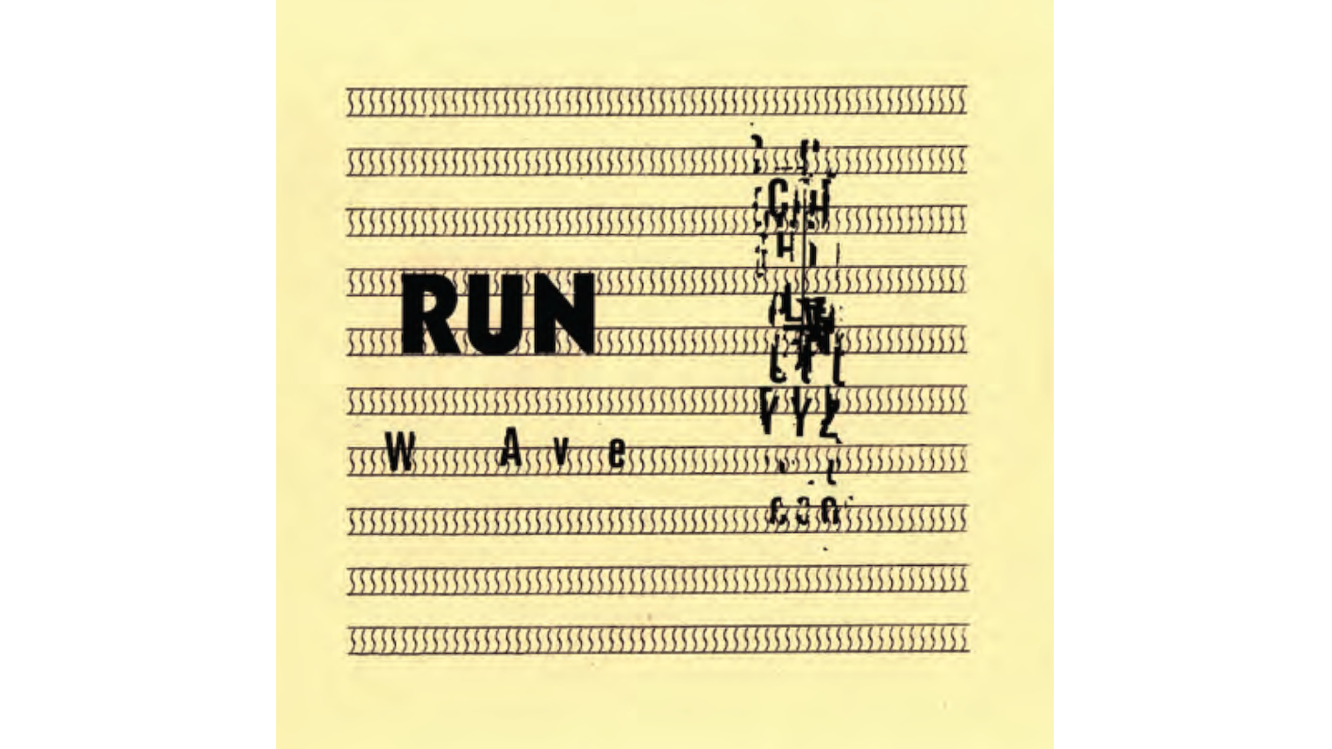
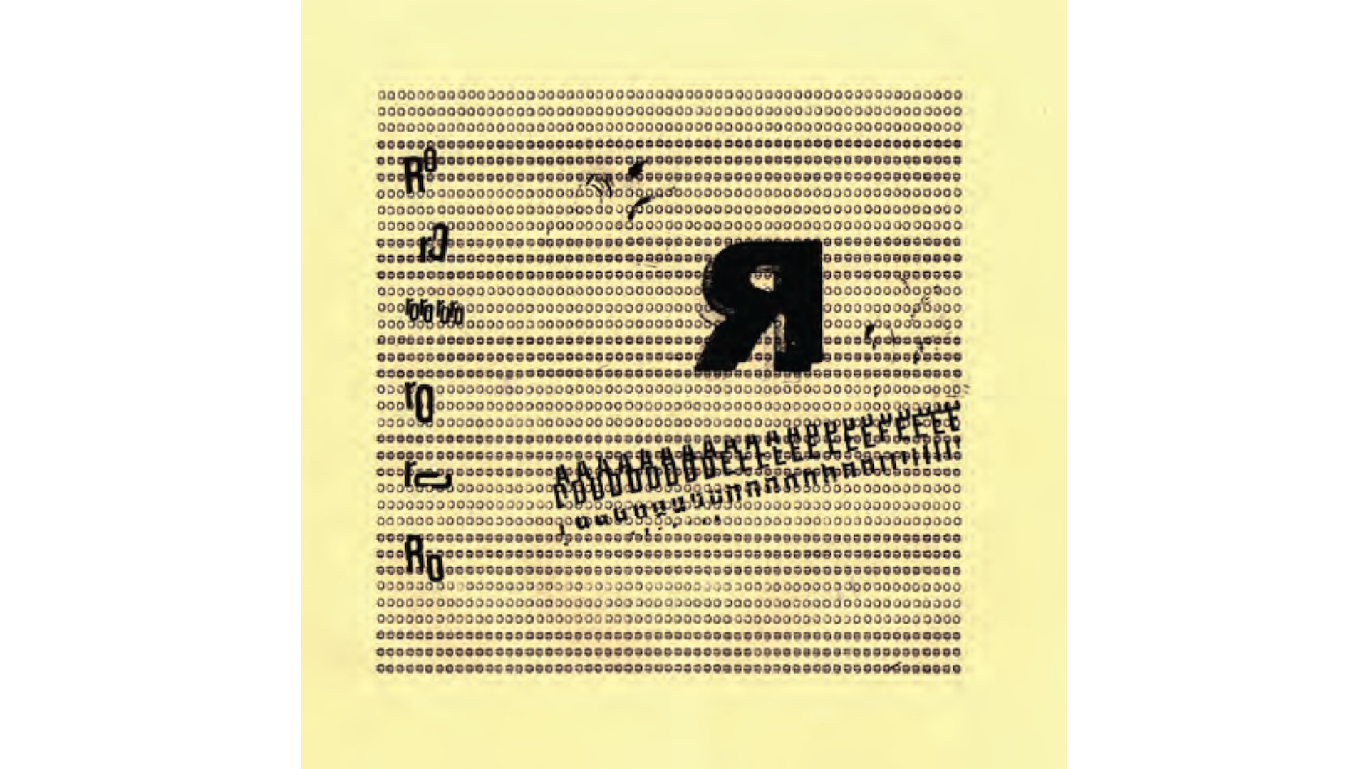
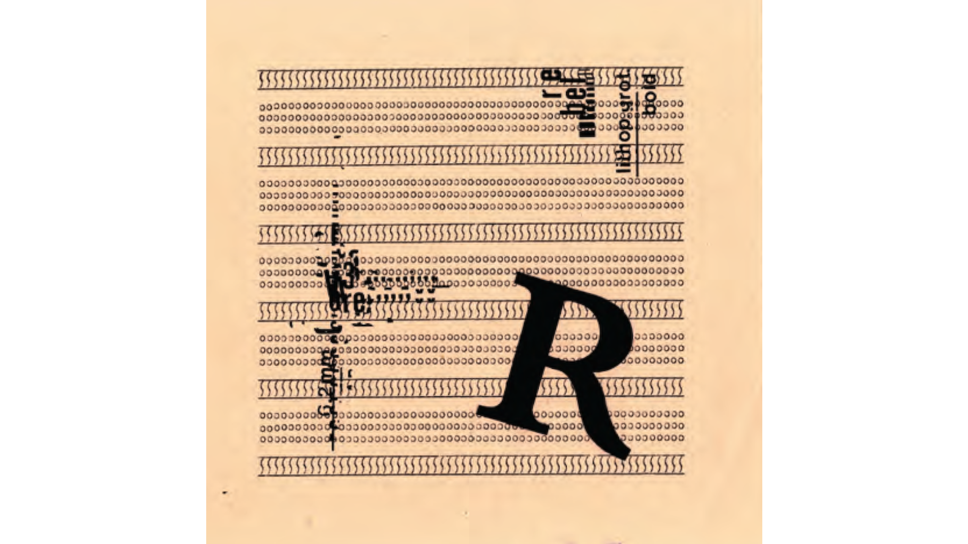
typographic plays
2022 - 2023
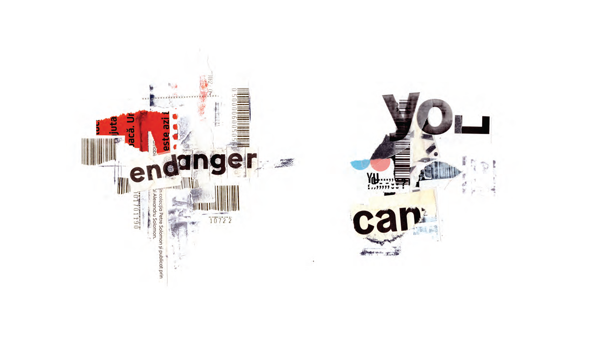
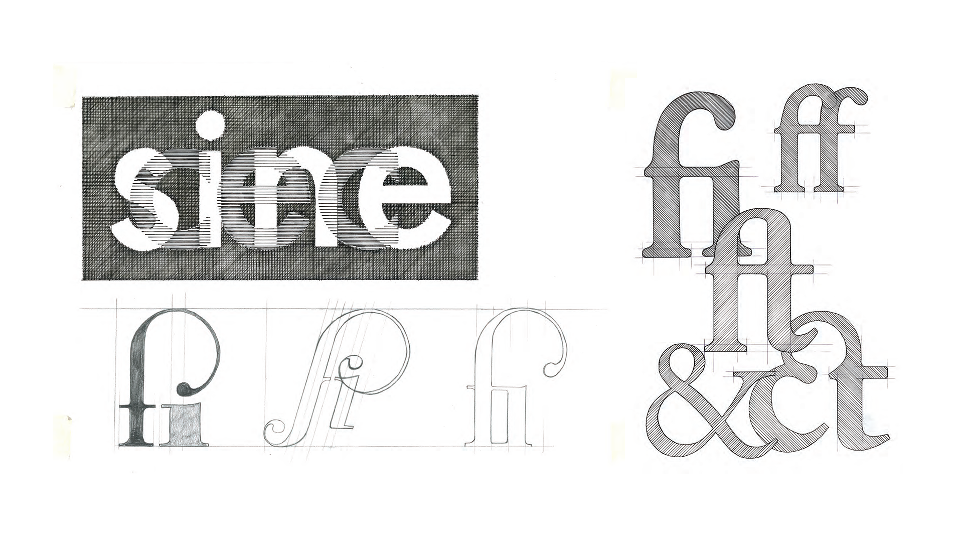
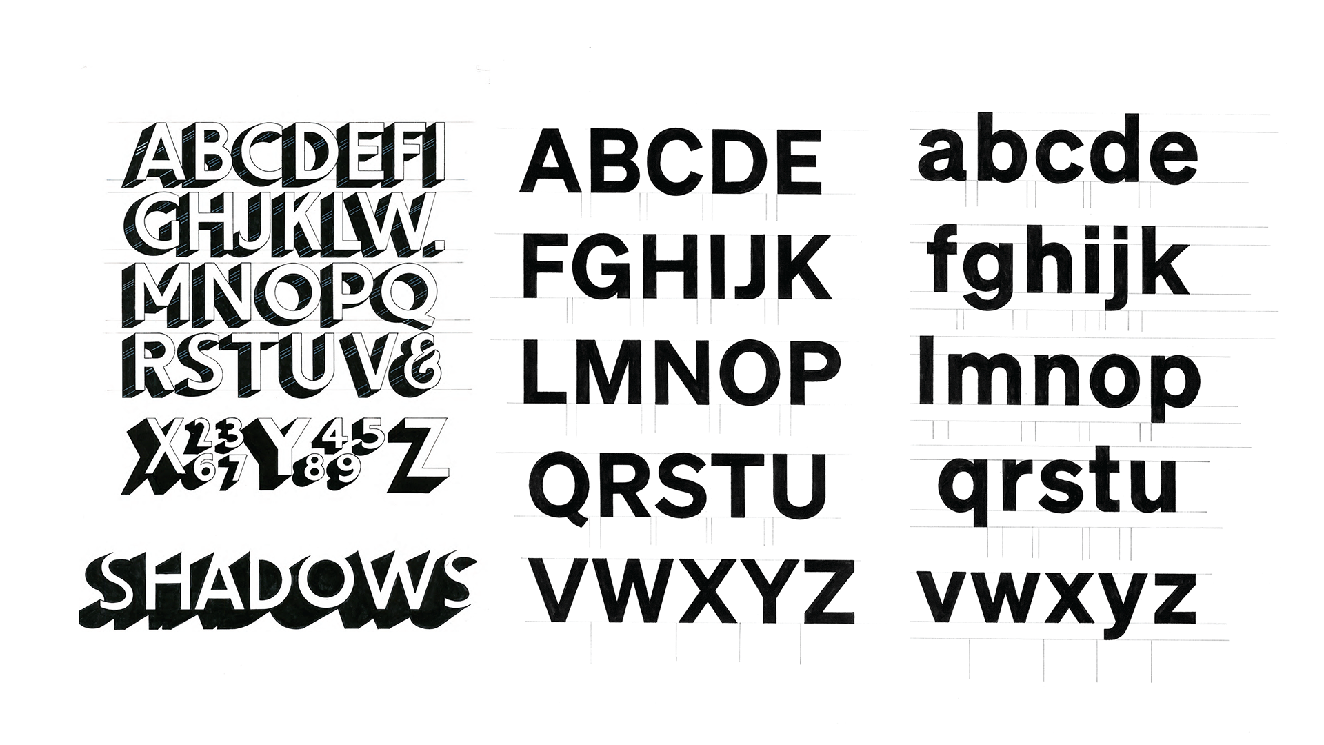
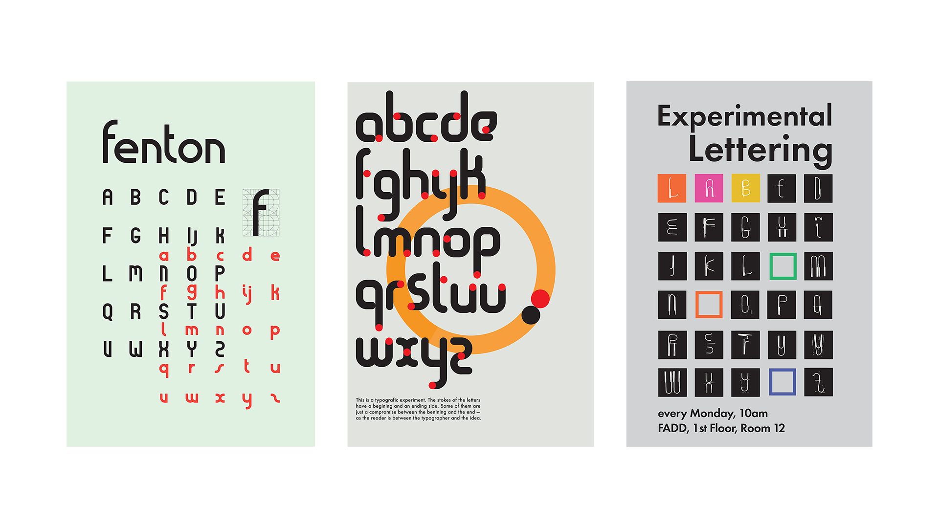
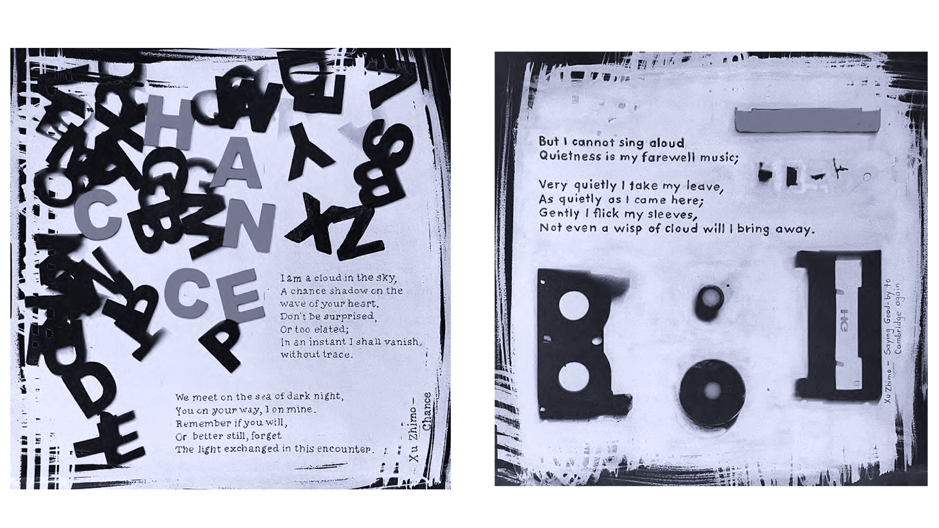
Some of my experiments with letterforms, ranging from the simple enjoyment of drawing letters to featuring new alphabets, creating typographic collages, and typewriter art.
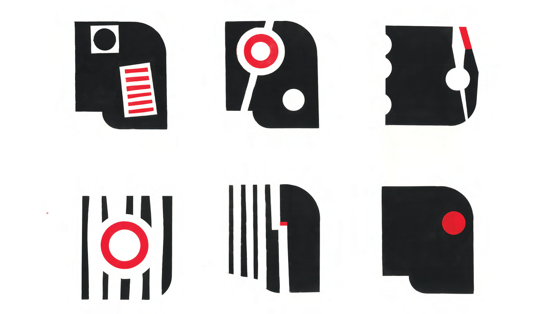
artworks
2022 - 2023
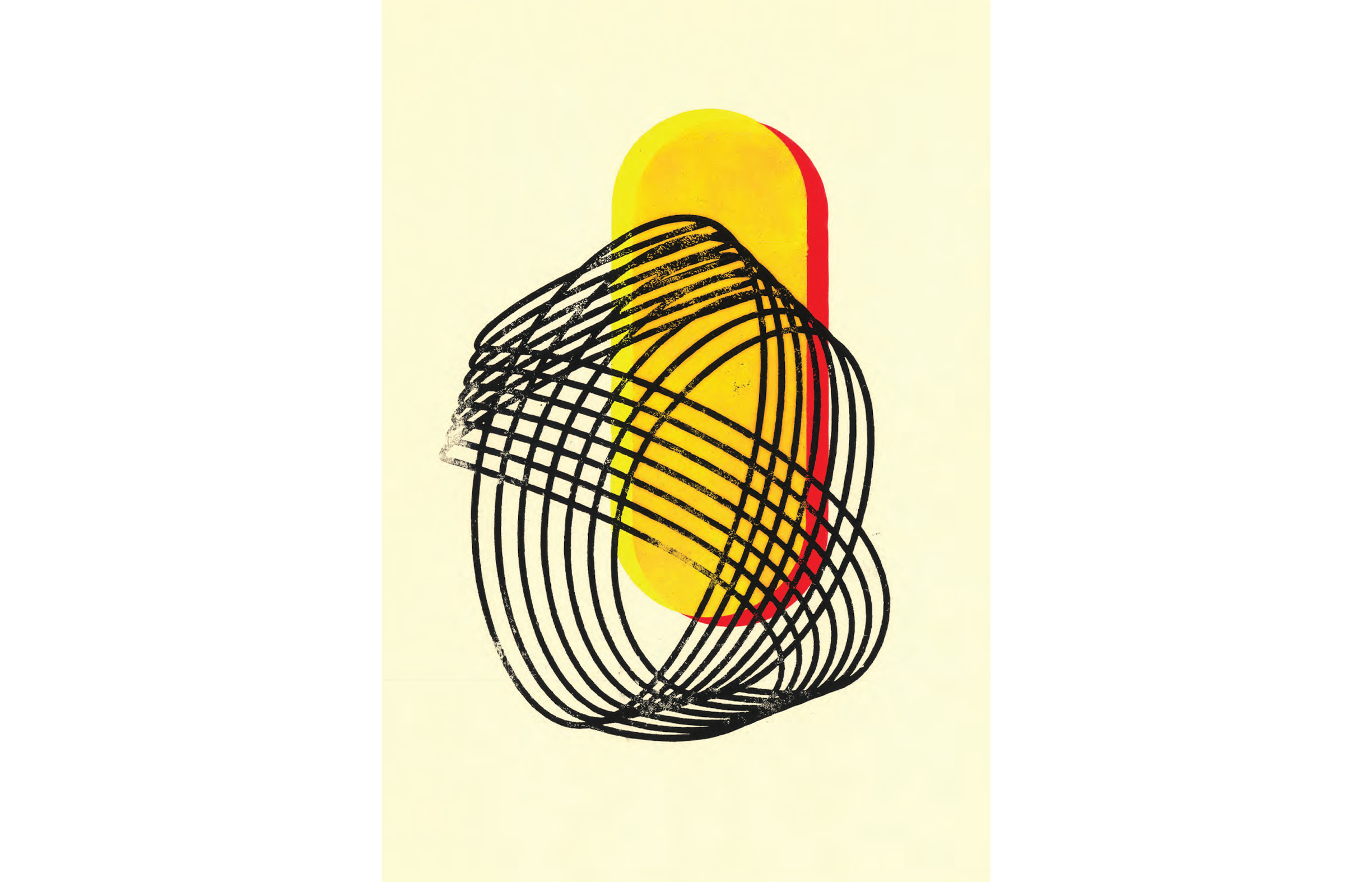
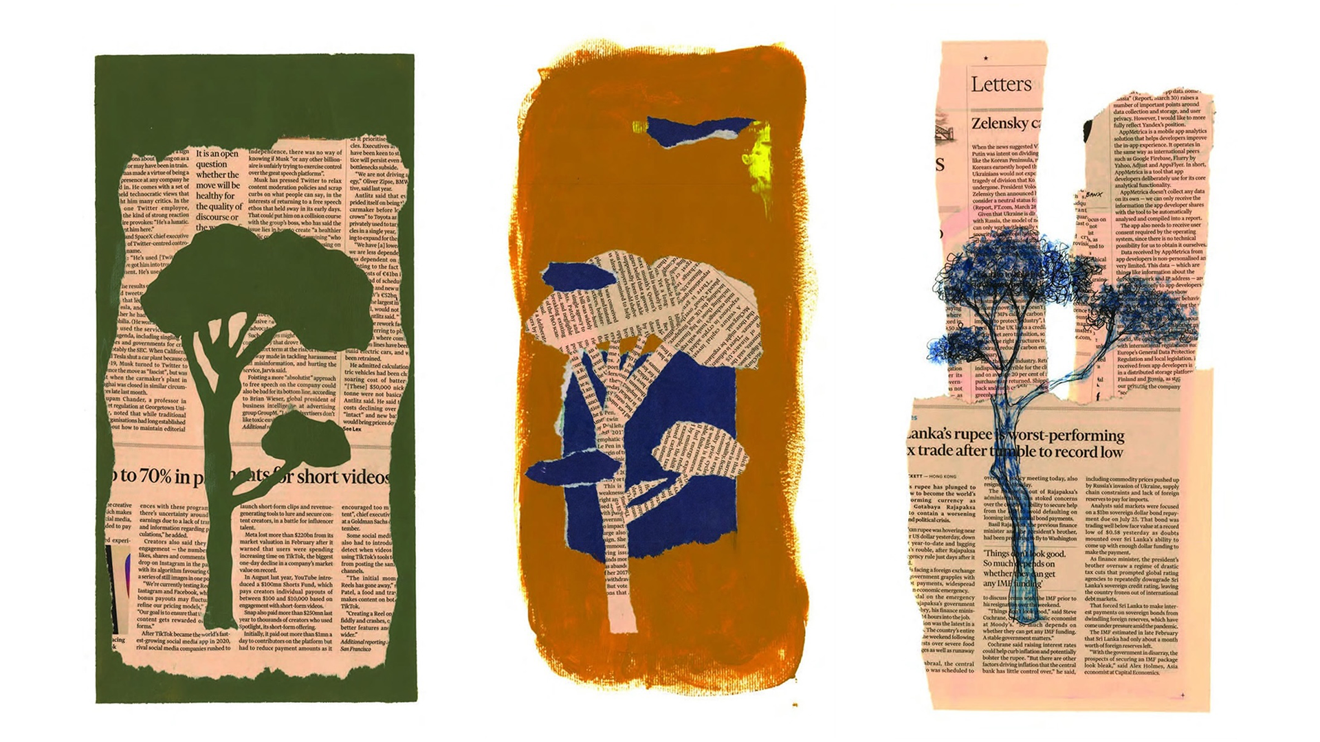
Nothing fancy, just a few hand-made printings at the highest possible level I could achieve.